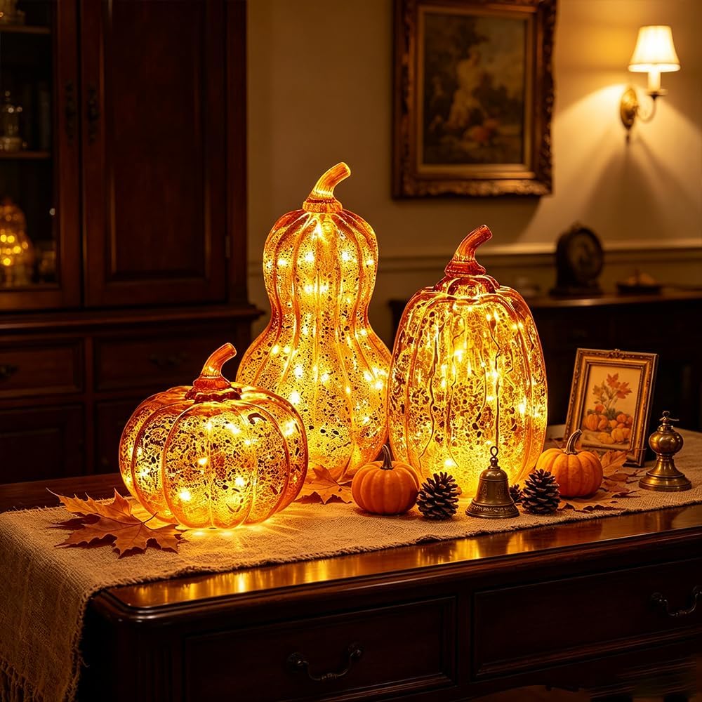
Halloween decor can easily tip into plastic pumpkins, novelty signs and decorations that feel out of place the moment October ends. A more interesting approach is to borrow from the visual language of old houses, antique shops and slightly eerie interiors: aged brass, dark wood, black candles, faded textiles, vintage-inspired artwork and objects that look as though they have been collected over time. Vintage Halloween decor works particularly well because it creates atmosphere without relying on obvious seasonal motifs. A tarnished candlestick, an ornate frame or a smoky glass vase can feel appropriately haunting in October and still earn its…
-
-
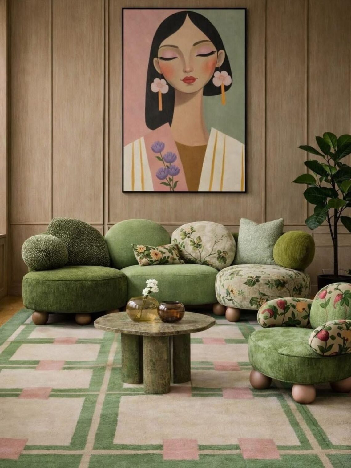
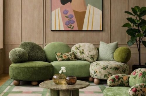
For much of the past decade, the safest interior was also the easiest to reproduce. Grey sofas, pale walls, matching finishes and carefully controlled styling circulated from property developments to furniture catalogues and social media feeds. The look promised versatility and broad appeal, but it also made homes increasingly difficult to distinguish from one another. This week, three separate signals point in the opposite direction. Green is overtaking grey in a major furniture category. New research suggests that saturated color can produce stronger positive emotional responses than muted shades. At the same time, designers and consumers are showing a renewed…
-
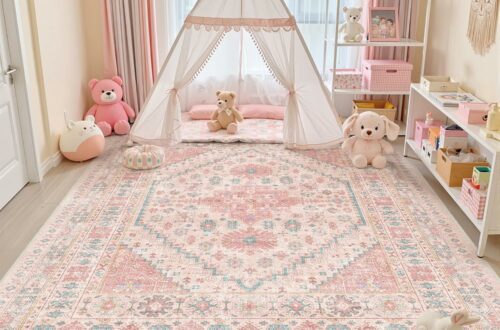
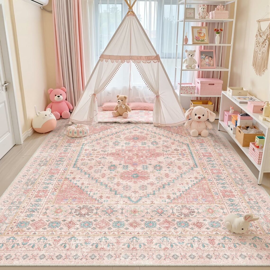
There’s something about a pink rug that changes the entire energy of a bedroom. Not louder, not busier, just warmer. Whether you’re leaning into a full blush-toned aesthetic or you want a single piece that softens an otherwise neutral room, pink is one of those colors (or tint in this case) that works harder than you’d expect. A pink rug can sit beautifully under a walnut bed frame, next to raw linen curtains, or against dark moody walls. It’s versatile in a way that surprises most people. We’ve pulled together 12 cute rugs for bedrooms – across styles, budgets, and…
-
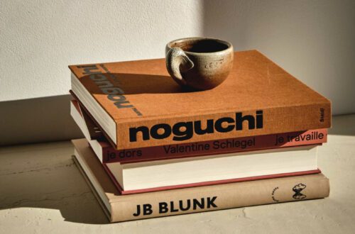
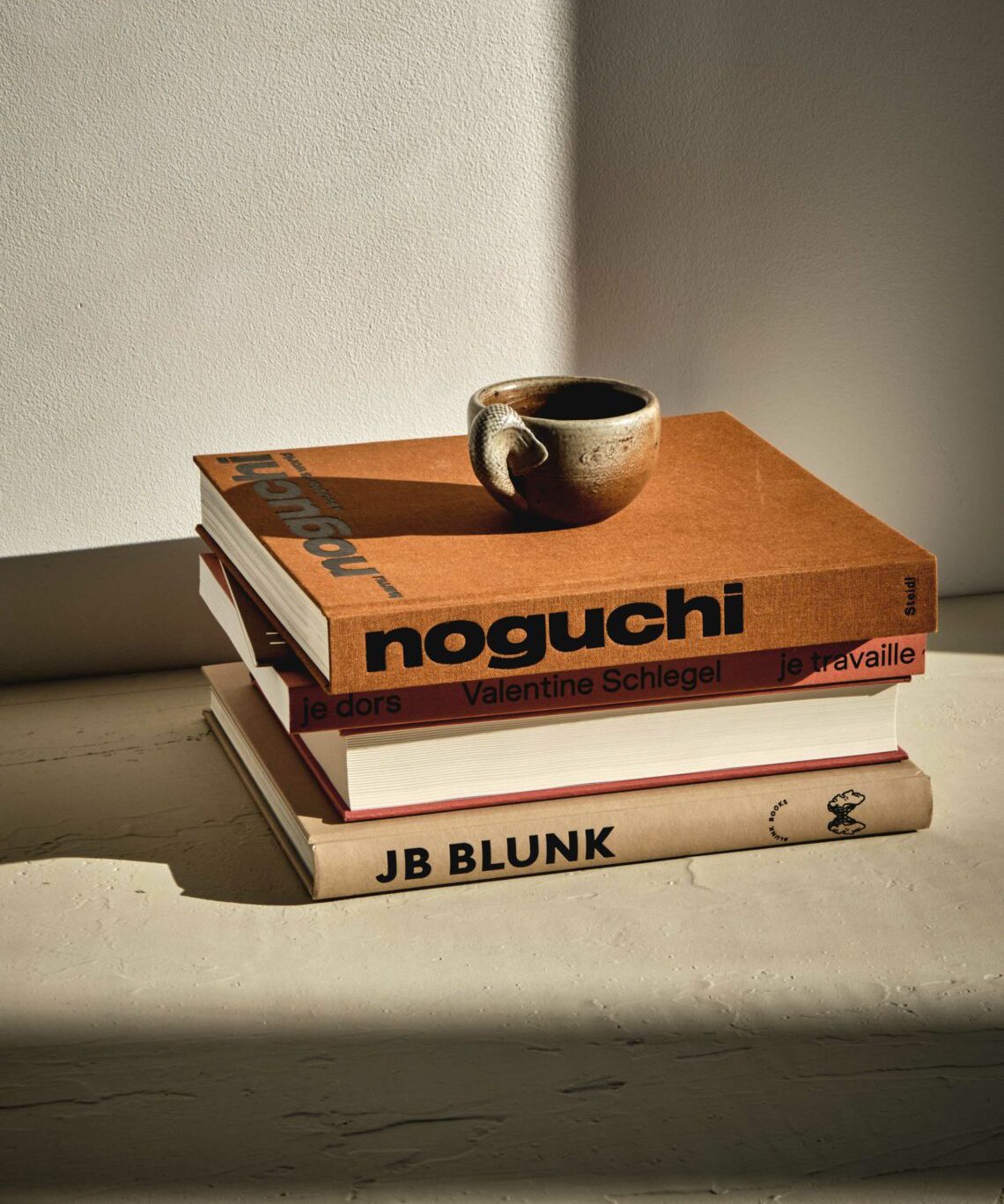
Books are no longer just for reading – they are one of the most versatile and elegant tools in the modern decorator’s toolkit. Whether you’re refreshing a living room, styling a console table, or looking for fresh home decor ideas that feel personal and layered, books offer something that no candle or sculpture can quite replicate: they carry culture, personality, and visual weight all at once. If you’ve been searching for book centerpiece ideas that go beyond the expected, this guide covers everything, from how to style stacks with intention to the specific design books worth displaying in every room.…
-
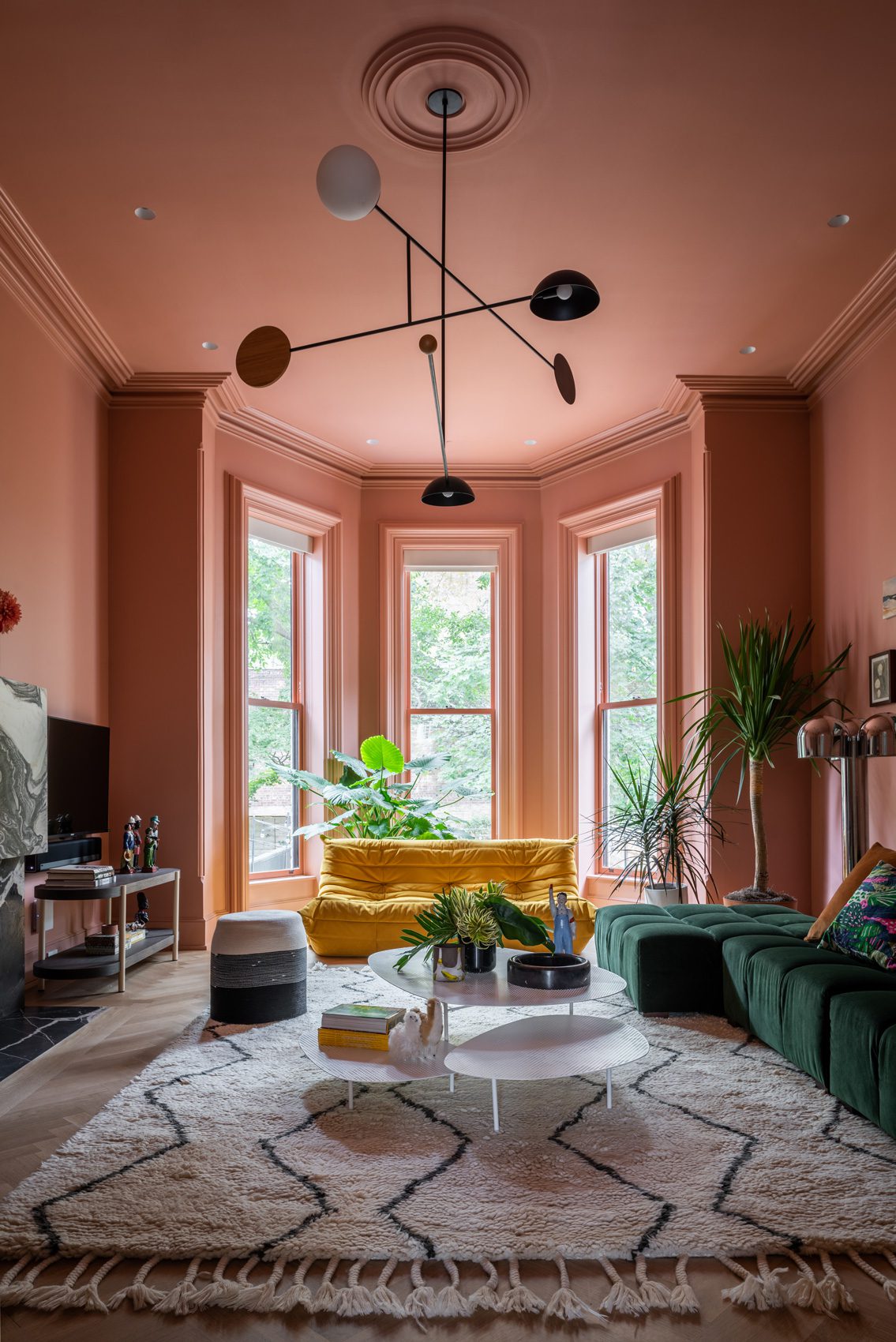
Originally published 2024, updated April 2026 Two years into the chromatic revolution, Color Drench has proven it’s far more than a passing moment — it has fundamentally reshaped how we think about living with color. What began as a bold reaction to minimalism has matured in 2026 into a design language of its own, one that’s becoming increasingly personal, emotional, and intentional. This innovative approach to color has taken the design world by storm, transforming spaces into immersive experiences. In this updated guide, we explore how Color Drenching has evolved since 2024, what’s driving it forward in 2026, and how…
-
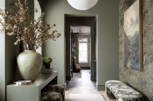
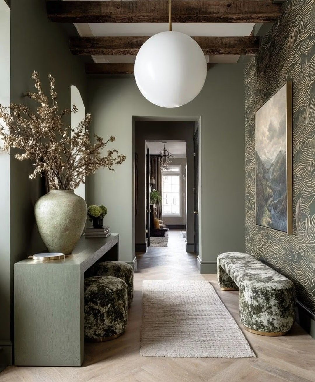
When it comes to interior color trends, few choices feel as endlessly versatile — or as quietly powerful — as green. It’s a color that almost needs no introduction: we associate it instinctively with nature, renewal, and ease. Whether you’re drawn to a mossy forest tone or a barely-there sage, green wall paint has an uncanny ability to transform a room’s atmosphere without overwhelming it. Part of what makes green so compelling is its sheer range. From the palest celadon to the deepest bottle green, from warm jade to cool mint, the spectrum is vast — and so is the…
-
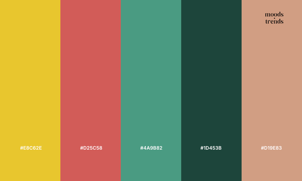
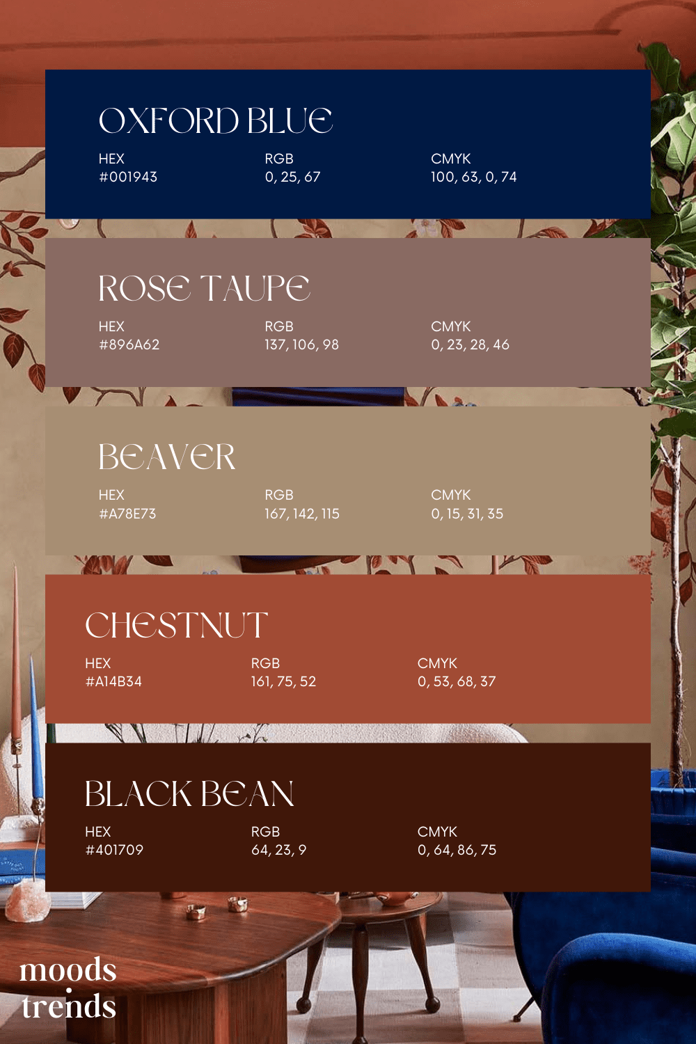
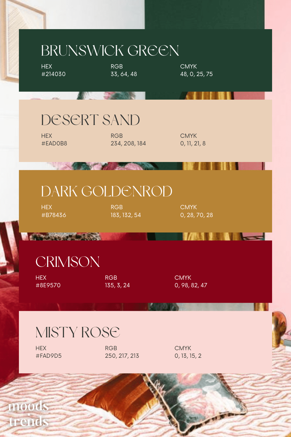
Explore 50 carefully curated color palettes spanning every mood, style, and aesthetic — from the deep drama of Velvet & Wine to the quiet restraint of Scandinavian Silence. Each palette is designed to inspire interiors, brand identities, and creative projects with color combinations that feel intentional, considered, and ready to use. Find your next palette at Moods & Trends.
-
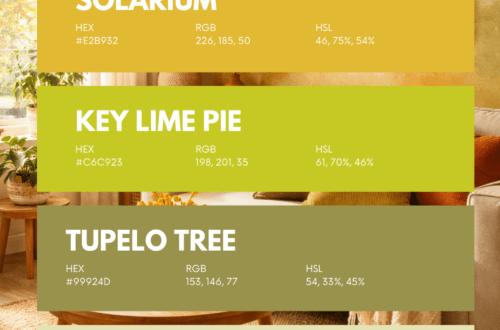
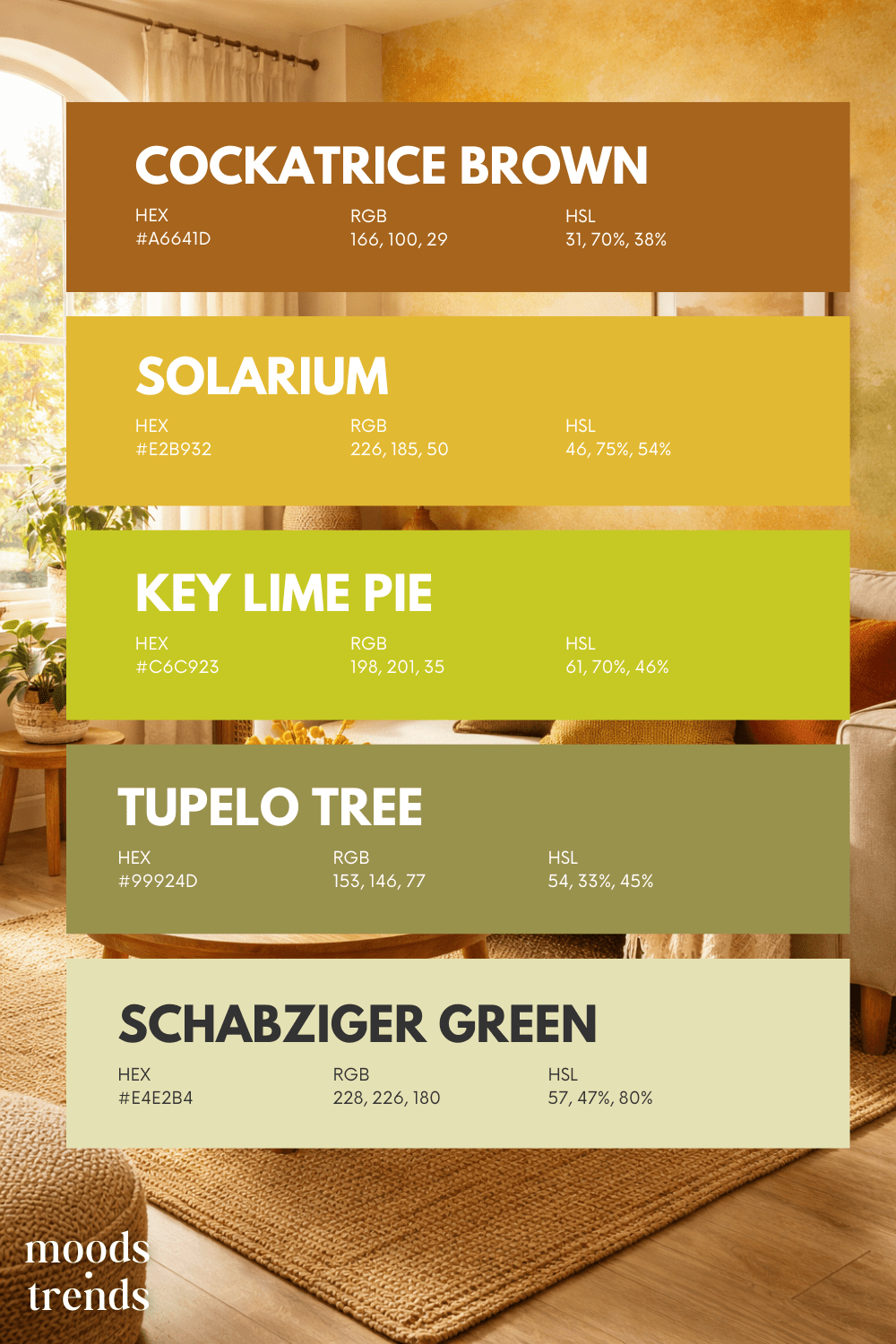
A warm and earthy palette inspired by sunlit fields and late-summer harvests. This palette combines deep amber, vibrant golden yellow, muted olive, and soft buttery neutrals. The result is a warm, organic color story reminiscent of wheat fields, sunlight, and autumn landscapes. This color palette was created by Moods & Trends. While we take responsibility for the overall composition and design, it’s important to note that the inspiration image are not owned by us. Moods & Trends does not claim ownership of these elements, and all rights belong to their respective owners. Any known credits for these elements are acknowledged…