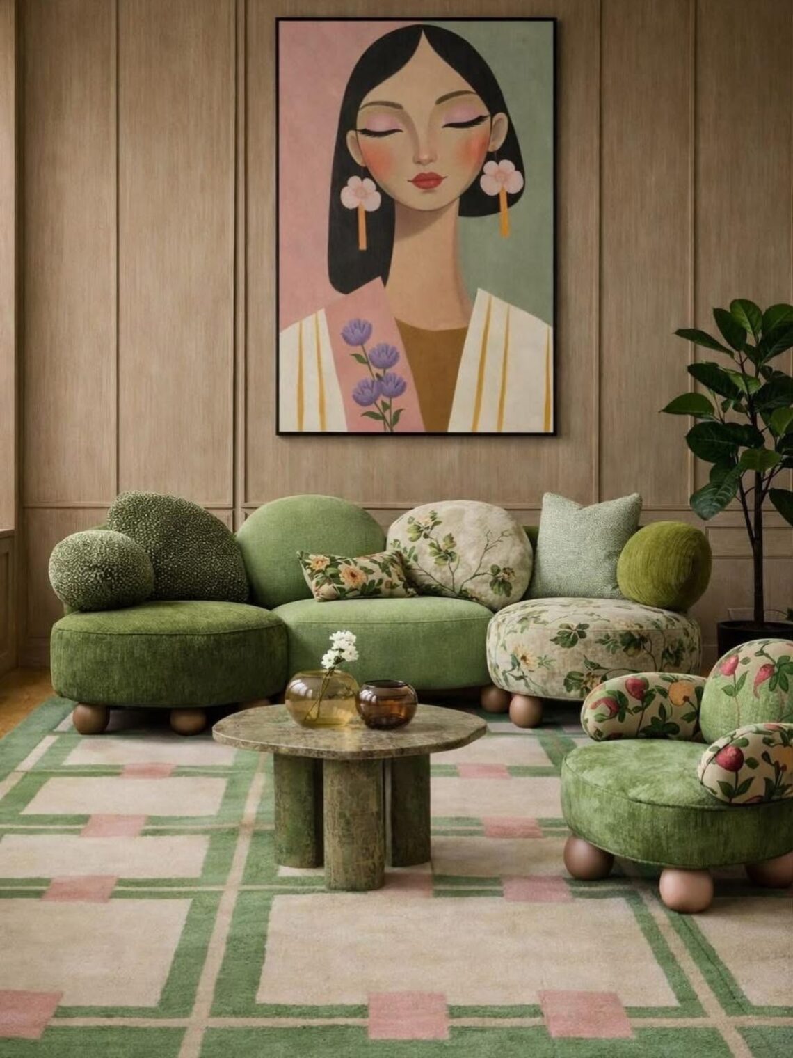
For much of the past decade, the safest interior was also the easiest to reproduce. Grey sofas, pale walls, matching finishes and carefully controlled styling circulated from property developments to furniture catalogues and social media feeds. The look promised versatility and broad appeal, but it also made homes increasingly difficult to distinguish from one another.
This week, three separate signals point in the opposite direction. Green is overtaking grey in a major furniture category. New research suggests that saturated color can produce stronger positive emotional responses than muted shades. At the same time, designers and consumers are showing a renewed interest in rooms that contain evidence of personal taste, manual work and use.
These are not simply signs that maximalism is returning. Together, they suggest a more consequential shift in the 2026 interior design trends: the idea of the universally tasteful home is losing some of its authority.
Green is becoming a practical neutral
The clearest commercial signal comes from sofa sales. According to figures reported by The Times, green sofas now account for 17 percent of sales at John Lewis, while grey represents 9 percent. Barker and Stonehouse reportedly sold five times as many green sofas as grey ones during the first half of 2026, with green sofa sales rising by 80 percent year on year.
The important detail is not only that green is selling. It is where the color is appearing.
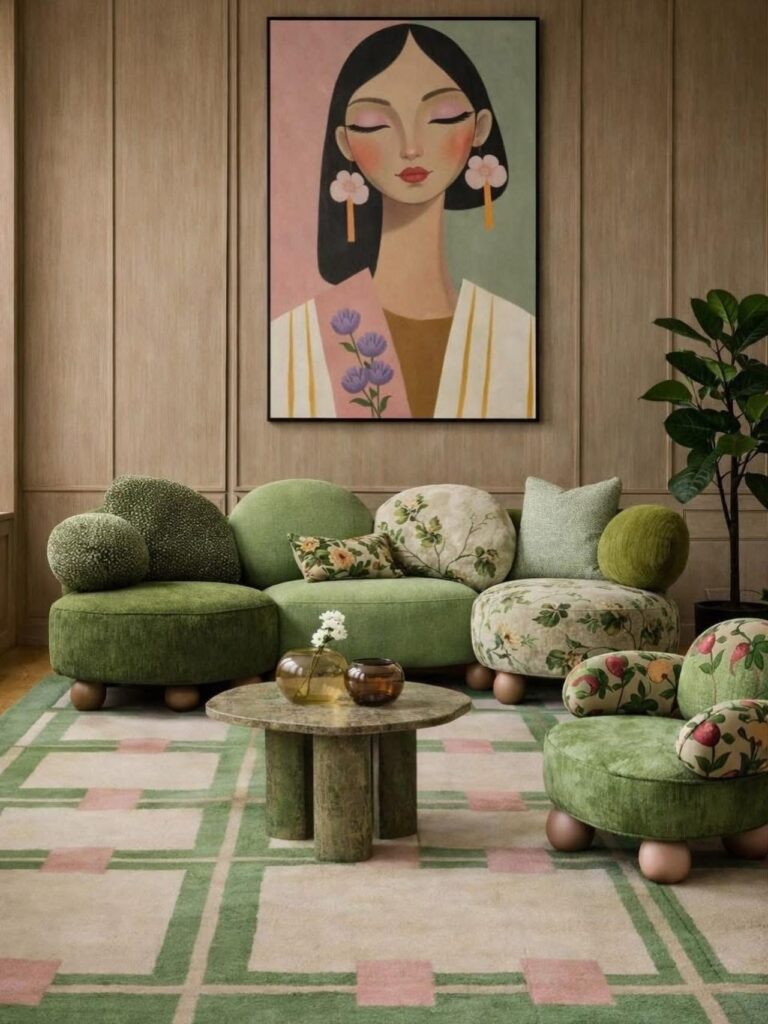
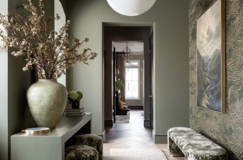
A cushion, lamp or vase can reflect a short-lived taste without demanding much commitment. A sofa is larger, more expensive and expected to remain in the home for years. Choosing green for that purchase indicates that consumers no longer see it exclusively as a statement color. Moss, olive and other earth-based greens are beginning to perform the role that grey once occupied: dependable, adaptable and unlikely to date quickly.
This does not mean that green has become visually neutral. It still has a perceptible temperature, connection to nature and emotional character. Its advantage is that it combines those qualities with unusual versatility. Olive can sit beside burgundy, dusty blue, ochre, walnut and aged brass. Moss works with natural linen, terracotta and dark timber. Forest green can create depth without the visual hardness of black.
Grey became dominant partly because it removed risk. Green offers a different kind of security. It is easy to coordinate, but it does not erase the atmosphere of a room.
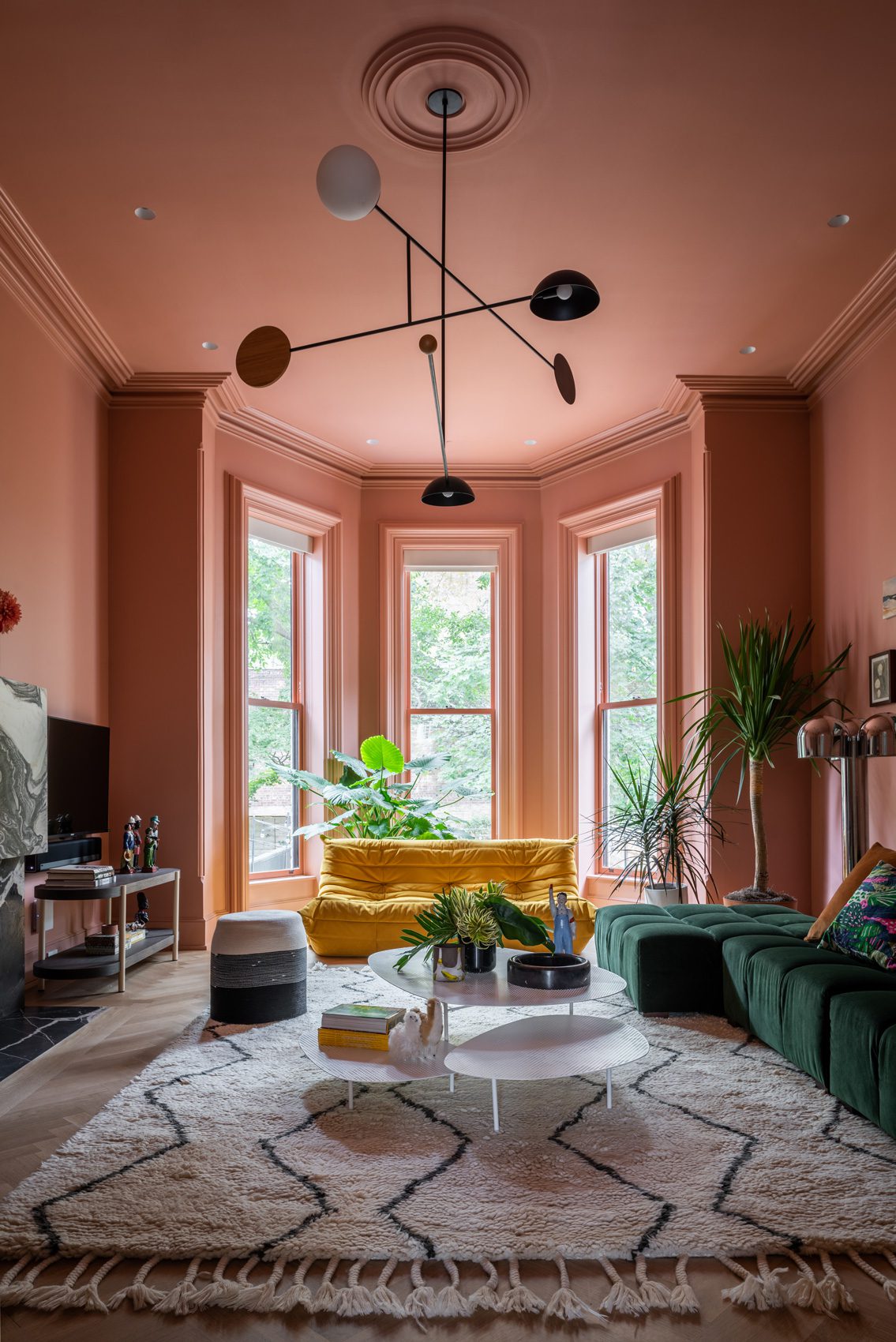
The current green sofa trend also fits a broader move toward earthier paint colors. Designers quoted in Vogue’s review of 2026 interior trends describe growing demand for muddy greens, caramel, ochre and high-contrast color combinations. Instead of treating color as a decorative layer applied after a room is designed, these schemes use it to establish weight, intimacy and identity.
For homeowners, the practical lesson is not to replace every grey sofa with a green one. It is to reconsider which colors genuinely have long-term value. A color can be distinctive without being difficult to live with.
Saturated color is challenging the idea of the calm home
The second signal comes from outside the interiors industry. The Royal Horticultural Society studied the emotional responses of 11,569 garden visitors to different flower colors and levels of saturation. Purple was the most popular flower color, selected by 26.67 percent of participants, while saturated colors accounted for 60 percent of preferences.
The emotional findings are particularly useful. According to the RHS research, saturated yellows, oranges and reds were more strongly associated with joy, excitement and vitality than muted versions of the same colors. Blues, blue-greens and purples were more often linked with calm and inspiration. Grey produced the lowest positivity and emotional intensity.
The study was conducted in gardens – interior spaces involve scale, light, material, function and prolonged exposure in ways that a flower display does not.
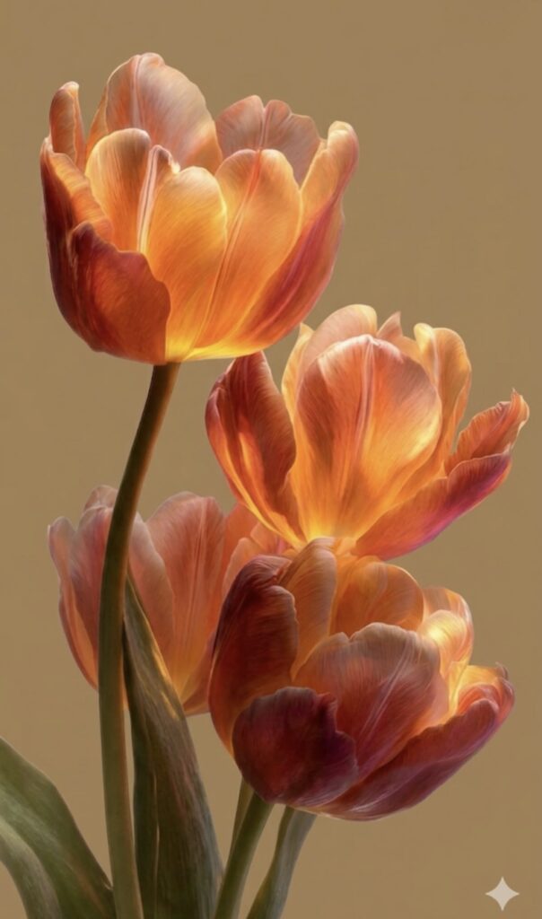
For years, calm interiors have been marketed through a narrow visual formula: off-white, beige, pale grey and low contrast. Saturation is usually positioned as stimulating, dramatic or risky. The RHS findings suggest that emotional comfort is more varied. Calm can come from cool saturated color, while warmer saturated colors may support the joy and vitality that people also want from their homes.
This opens a more useful direction for biophilic design. Bringing nature indoors does not have to mean adding greenery to an otherwise neutral room. It can mean studying the color relationships found in gardens: violet against leaf green, a small area of red within deep foliage, yellow surrounded by brown and olive, or blue softened by irregular natural textures.
The distinction between saturation and brightness also matters. A saturated color contains a clear, concentrated hue, but it does not have to be fluorescent or visually aggressive. Aubergine, oxblood, moss and ochre can all be saturated while remaining grounded. Their intensity becomes easier to live with when balanced by timber, stone, wool, linen and changing daylight.
The strongest 2026 interior color trends may therefore be less about individual colors and more about permission. Consumers are becoming more willing to believe that an emotionally supportive home can contain contrast, depth and visible color.
The anti-algorithm home values evidence of a person
For years, social platforms made inspiration more accessible while repeatedly rewarding a limited range of highly legible interiors. Images with pale palettes, clean surfaces and familiar furniture could be understood quickly on a small screen. As the same references circulated, aspiration became increasingly standardized.
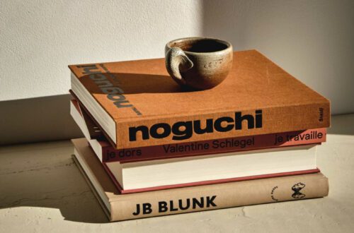
Vogue now describes an emerging “anti-algorithm era” in interiors. Designers report that clients are moving away from asking for replicas of saved images and toward combinations of periods, materials and objects with personal meaning. The same report identifies lived-in rooms, reclaimed wood, textiles, handmade details and finishes that improve with age as important directions for 2026.
A related change is visible in the renewed interest in making and repair. A recent Livingetc investigation into the DIY revival connects upholstery, ceramics, mending and hands-on renovation with a desire for greater agency in an increasingly digital culture.
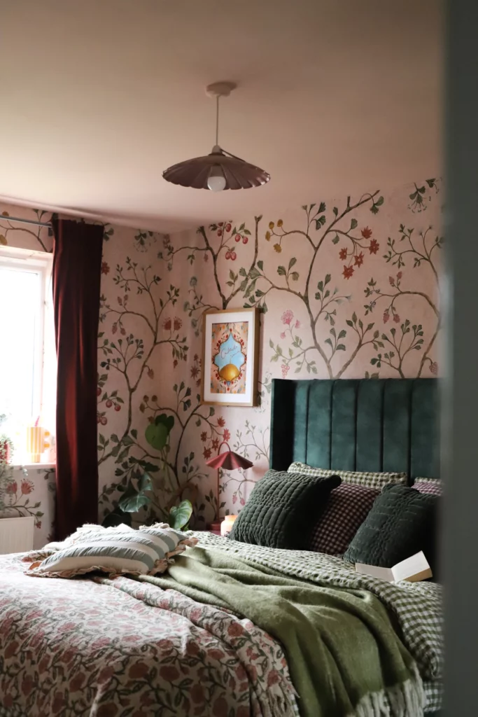
This helps explain why vintage and handmade pieces now carry value beyond nostalgia. They introduce variation that is difficult to achieve through coordinated retail collections.
Personalization, however, should not become another visual formula. The anti-algorithm home is defined less by a recognizable aesthetic than by the process through which it develops.
That process may include keeping a useful object long enough for it to acquire wear, buying one piece from a local maker, restoring furniture, displaying something connected to a place or person, or allowing the practical rituals of the household to influence the room. The result does not need to be eclectic, maximalist or expensive. A restrained interior can still be deeply personal if its choices are specific.
What these signals mean together
Green sofas, saturated gardens and handmade interiors may appear to belong to separate trend stories. Their common subject is the return of emotional and personal information to the home.
Grey, low saturation and coordinated furniture became popular because they reduced the possibility of error. They also suited property marketing, mass production and digital circulation. The new signals do not indicate that neutral interiors will disappear. They show that neutrality is no longer the only convincing expression of good taste.
The direction to watch is selective commitment. Consumers are choosing color for larger, longer-lasting pieces. They are questioning the assumption that wellbeing requires visual quiet. They are also looking for objects and rooms that show where they came from and who uses them.
For designers and brands, this changes the language of value. Versatility still matters, but it can no longer mean absence of character. Products will need to demonstrate material quality, emotional relevance, adaptability and a credible relationship to making. For consumers, the opportunity is simpler: to make fewer choices for an imagined future buyer or online audience, and more for the life already taking place inside the home.
Related reading
The Best Shades of Green Wall Paint
Color Drench Trends of 2026: The Chromatic Revolution