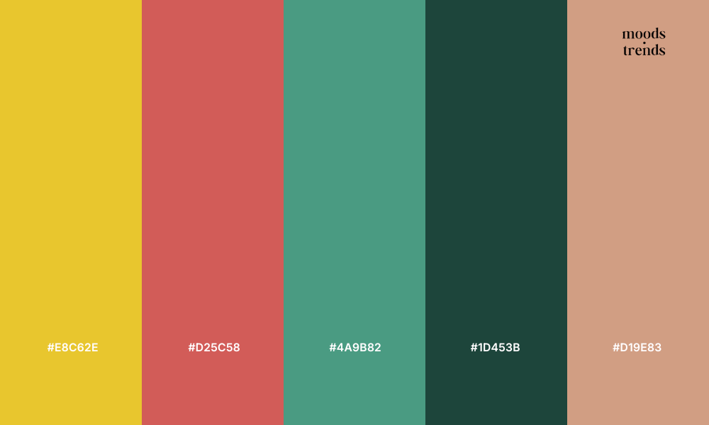
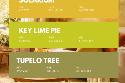
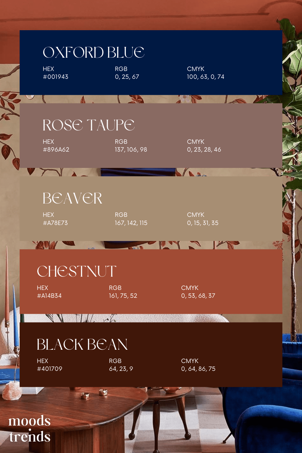
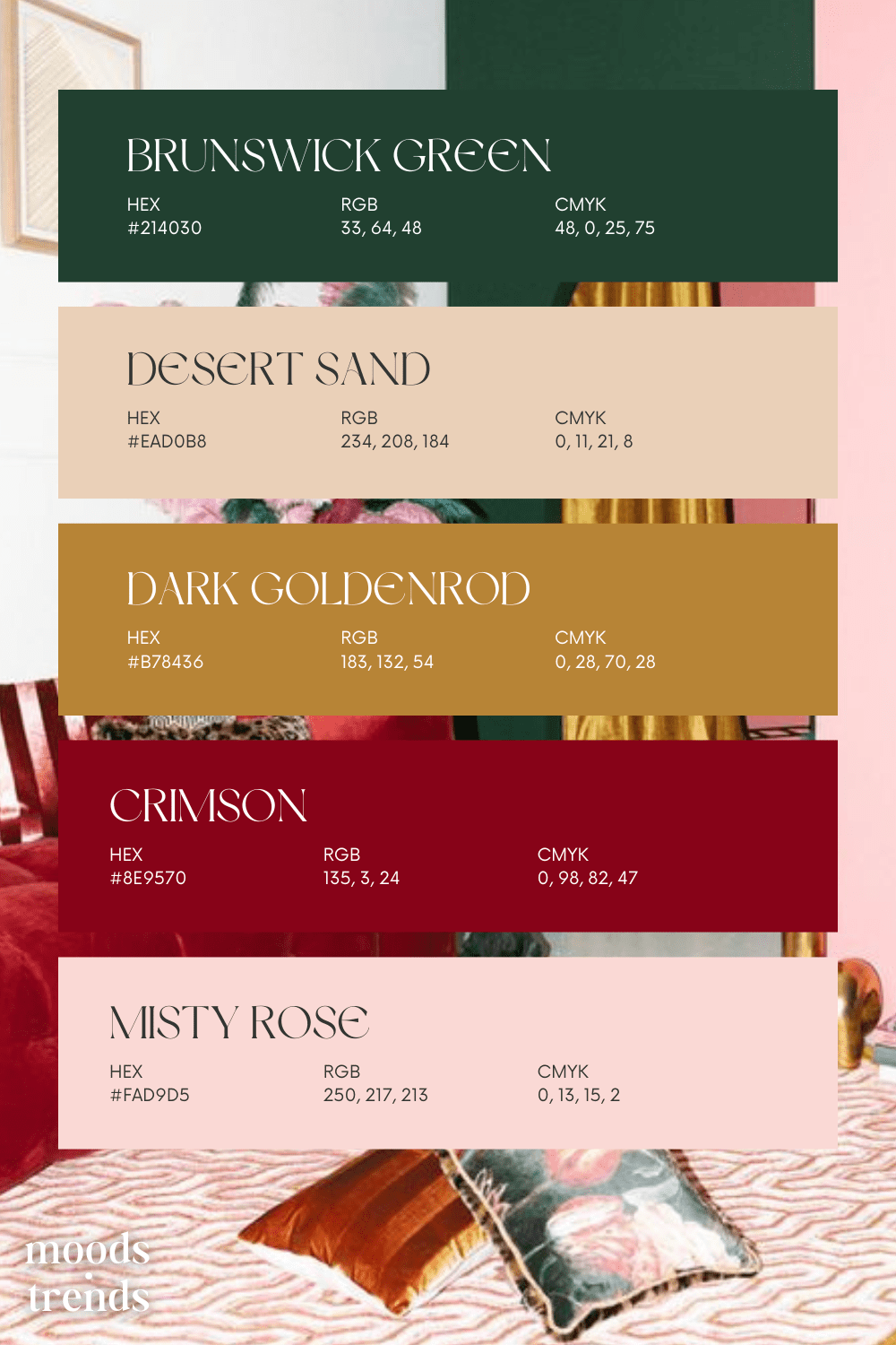
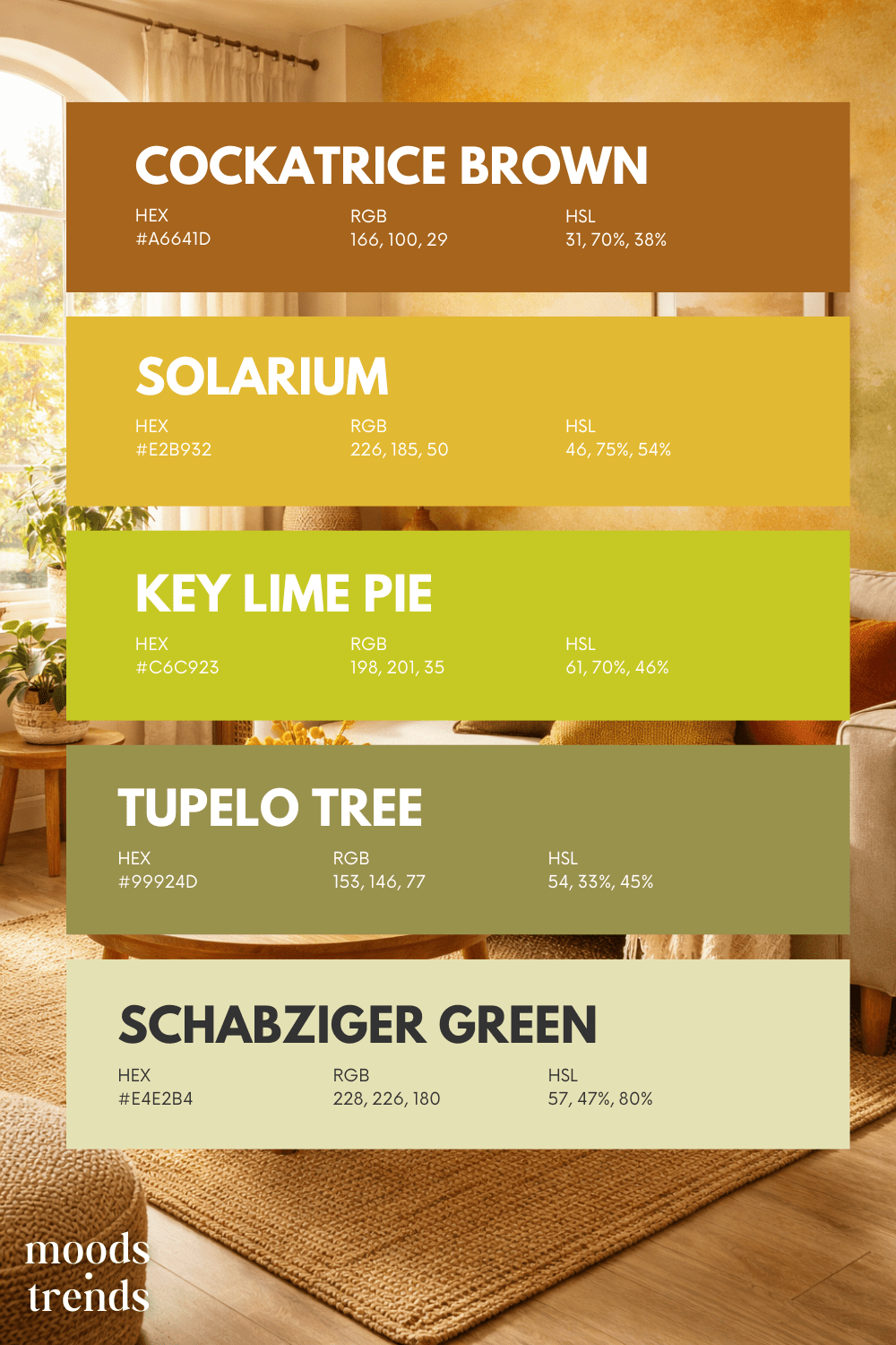
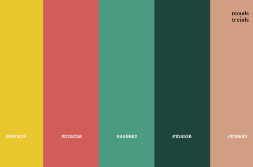
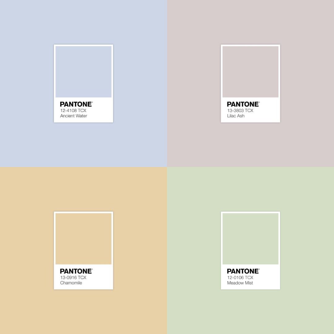
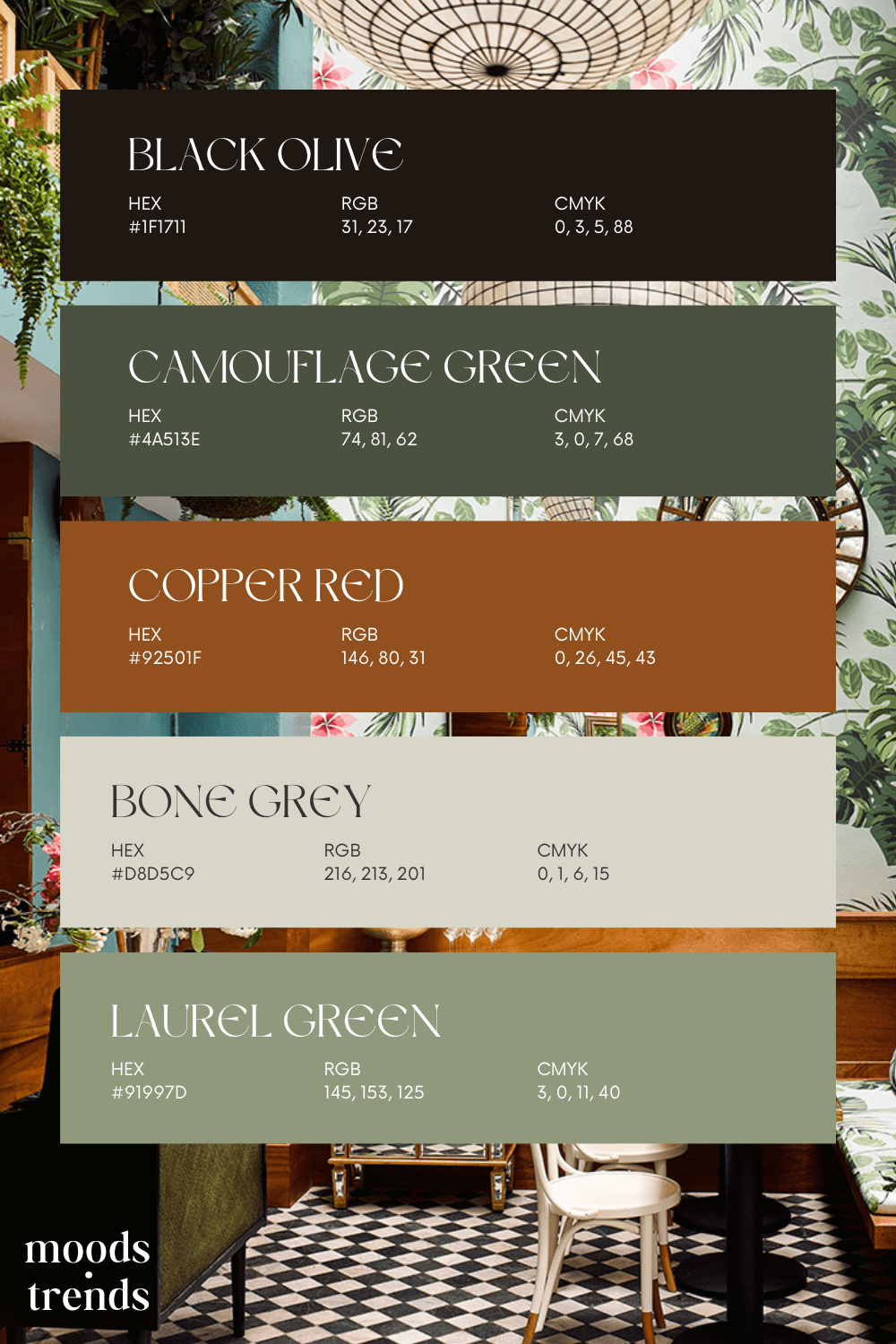
Light blue has long held a quiet but powerful place in the world of interiors, it sits in a nuanced space between color and atmosphere. In recent years, light blue has re-emerged as a defining element within evolving color trends, valued for its ability to evoke calm and timeless elegance. Color is never just visual; it is emotional and psychological. Unlike cooler whites or pale grays, light blue introduces softness without heaviness. It reduces visual tension while still offering character. Designers often describe light blue as restorative. It slows the pace of a room, encourages focus without stimulation, and creates…
-
-
Scandinavian design has become synonymous with simplicity, functionality, and understated elegance. Originating from the Nordic countries—Denmark, Sweden, Norway, and Finland—this design philosophy has clean lines, neutral color palettes, and a harmonious blend of form and function. We will delve into the essence of Scandinavian design, exploring its key elements perfectly showcased in model Josephine Skriver’s home. This is a project first featured in Architectural Digest, made by interior designer Elisa Baran Tréan. All photography is credited to Architectural Digest and photographer Nikolaj Thaning Rentzmann. The Core Principles of Scandinavian Design At its heart, Scandinavian design is rooted in the principles…
-
“Twilight Ember” is a sophisticated and warm color palette that blends deep, introspective blues with earthy browns and soft, muted neutrals. The palette evokes the serene transition from day to night, capturing the quiet elegance of twilight and the comforting glow of embers. Ideal for creating a cozy and refined atmosphere, “Twilight Ember” balances rich, bold shades with gentle, natural tones, making it perfect for designs that aim to evoke a sense of warmth and timeless elegance. This palette was inspired by the Chinoiserie Nude Wallpaper by Belarte Studio. We give credits to the original author. This color palette was…
-
“Autumn Ember” captures the essence of a crisp fall day, where golden leaves crunch beneath your feet and the air carries a hint of spice. Rich hues of burnt crimson and deep green mingle with warm earthy tones, reminiscent of cozy sweaters and crackling bonfires. This palette invites you to embrace the season’s warmth, with touches of vibrant red adding a flicker of intensity like dancing flames against a twilight sky. This palette was inspired by the following image found on Pinterest. We give credits to the original author. This color palette was created by Moods & Trends. While we…
-
In the realm of interior design, color holds a profound significance. It’s not merely about aesthetics; it’s about creating moods, enhancing spaces, and evoking emotions. Among the myriad of color palettes available, pastels stand out for their soft, gentle hues that bring a sense of tranquility and sophistication to any space. Color plays a pivotal role in interior design, influencing the ambiance and atmosphere of a room. Whether it’s a vibrant shade that energizes or a muted tone that soothes, the right color palette can transform a space completely. Pastel color palettes, in particular, offer a subtle yet impactful way…
-
“Rustic Serenity” captures the essence of tranquil nature with its harmonious blend of deep earthy tones and soft neutrals. Rich browns and greens evoke the warmth of a forest floor, while light grays provide a serene backdrop, balancing the palette with a touch of sophistication. This palette is perfect for creating cozy yet refined atmospheres, ideal for rustic-themed weddings, nature-inspired interiors, or artisanal branding. This color palette was inspired by Leo’s Oyster Bar, San Francisco This color palette was created by Moods & Trends. While we take responsibility for the overall composition and design, it’s important to note that the…
-
“Sunset Harvest” evokes the warm, inviting hues of a late summer evening. With tones ranging from the soft glow of ripe apricots to the deep richness of earthy terracotta, this palette captures the essence of a bountiful harvest under the setting sun. Delicate peach blends with golden wheat, while rustic brown hints at the earthy soil below. Accentuated by a touch of verdant green, these colors come together to create a comforting and nostalgic atmosphere reminiscent of gathering around a table filled with the season’s bounty. This color palette was inspired by the interior of restaurant Andia Marseille. Project was…


