Color is rarely just decoration. In the hands of a thoughtful designer, it becomes a language — one that communicates mood before a single word is read, establishes trust before a product is touched, and shapes the way a space, brand, or interface is remembered long after the first encounter.
This guide brings together 50 carefully curated color combinations across a range of palettes, moods, and applications. Whether you are designing a living room, building a brand identity, or crafting a digital experience, the right combination of colors can make all the difference.
Understanding Color: The Foundation
Before diving into combinations, it helps to understand what makes colors work together in the first place.
The Color Wheel
At the heart of color theory sits the color wheel — a visual map of how colors relate to one another. Primary colors (red, yellow, blue) form its foundation. Secondary colors (green, orange, violet) emerge from mixing them. Tertiary colors bridge the two. The wheel is not just a reference tool; it is a decision-making instrument. Where a color sits in relation to another tells you whether they will harmonize, contrast, or create tension.
Color Harmony
Harmony is what separates a palette that feels intentional from one that feels accidental. When colors are harmonious, they work as a system — each one reinforcing the others rather than competing for attention. A well-considered palette does several things at once: it guides the eye, establishes hierarchy, supports accessibility, and carries emotional weight. Done well, it becomes inseparable from the identity of whatever it serves.
Color Properties
Hue, value, saturation, and temperature all influence how a color reads in context. A warm yellow placed against a cool gray behaves very differently from the same yellow placed against ivory. Shifting saturation can transform an energetic accent into a whisper of a tone. These properties are levers — understanding them gives you control over the subtler effects a palette can produce.
Color Psychology
Colors carry associations that run deeper than personal preference. Deep navy suggests reliability and calm. Terracotta evokes warmth and groundedness. Sage green brings a sense of quiet restoration. When building a palette, it is worth asking not just whether the colors look good together, but what they are saying — and whether that message aligns with the mood you are trying to create.
50 Color Combinations
01 Color Palette COASTAL SAGE
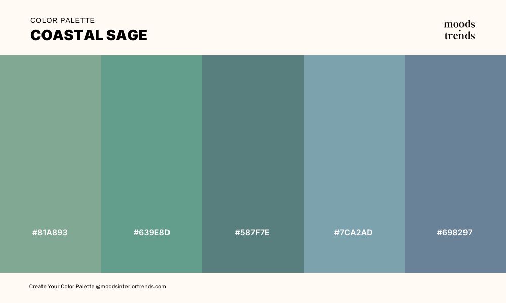
A palette drawn from the meeting point of land and sea — soft teals, muted sage greens, and dusty blues that carry the quiet atmosphere of a shoreline at low tide. Neither fully green nor fully blue, these tones exist in the in-between, evoking salt air, weathered driftwood, and the stillness of coastal mornings.
02 Color Palette BLUSH & LINEN
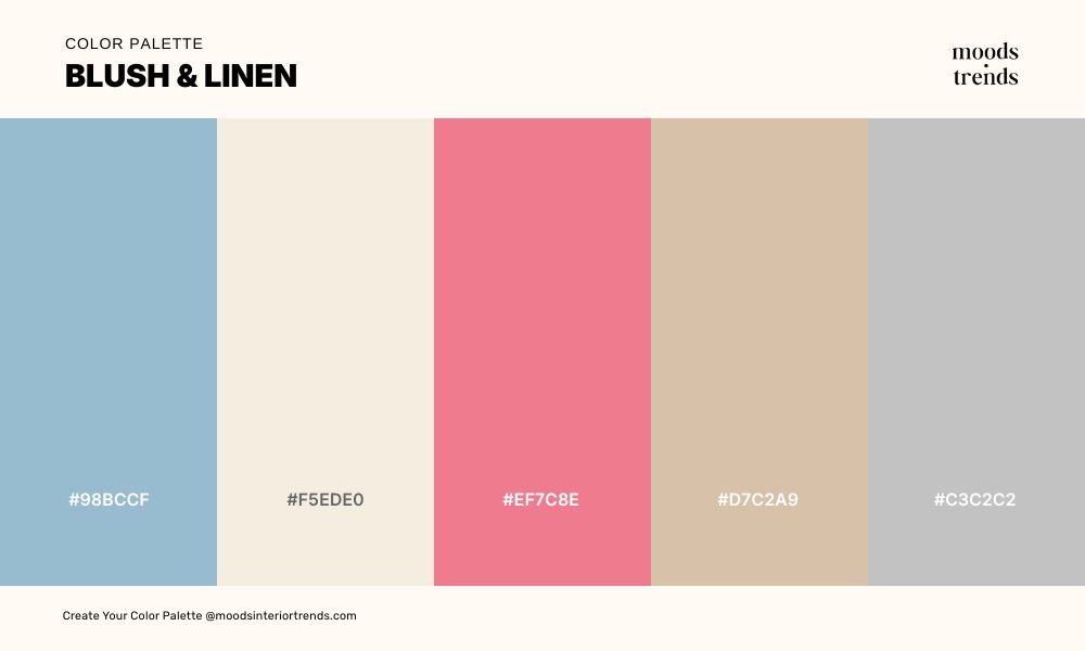
A palette that balances the warmth of soft rose and ivory with the quiet coolness of dusty blue and pale gray — delicate without being fragile, feminine without being obvious. These are the colors of worn cotton, dried petals, and afternoon light through sheer curtains. A versatile combination for interiors, editorial design, and brands that want to feel refined, warm, and quietly romantic.
03 Color Palette BLUE HOURS
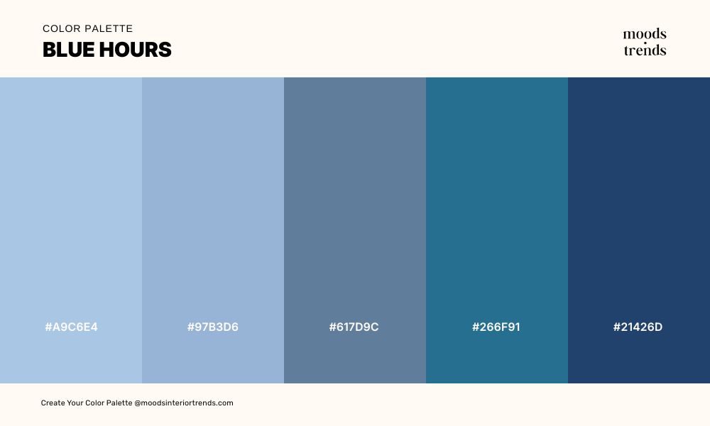
A palette that moves with quiet authority from soft powder blue down into the depths of midnight navy, tracing the full range of blue’s emotional register in a single sweep.
04 Color Palette AUTUMN SEASON
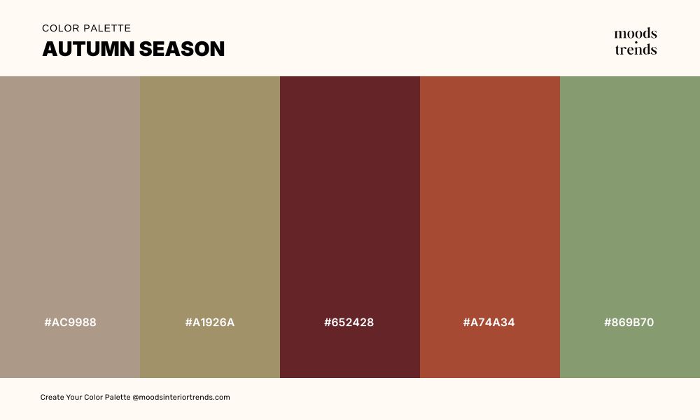
A palette that captures the full complexity of autumn at its peak — warm terracottas, burnt siennas, and dusty golds in conversation with a single note of muted olive green that grounds everything in the natural world. A richly layered combination that brings depth, warmth, and seasonal character to interiors, brand identities, and editorial design.
05 Color Palette STILL AIR
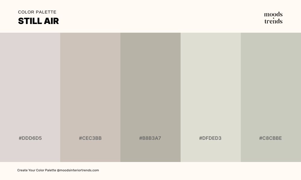
A palette so quietly neutral it barely announces itself — warm whites, soft greiges, and muted linens that exist at the very edge of color, carrying warmth without hue and texture without contrast. These are the tones of undyed fabric and unfinished plaster. The most restrained palette in any collection, and precisely because of that restraint, one of the most powerful.
06 Color Palette THE GLOAMING
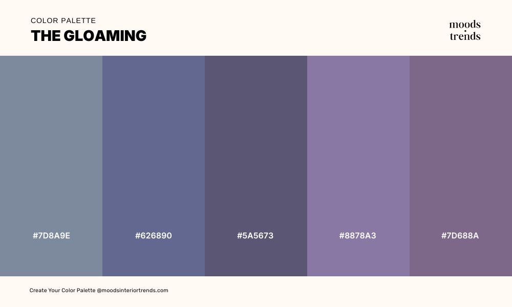
A palette that occupies the blurred threshold between blue and violet — dusty slates, muted periwinkles, and soft mauves that refuse to settle into either color family, existing instead in the ambiguous, quietly mysterious space between them.
07 Color Palette DRIED BOTANICALS
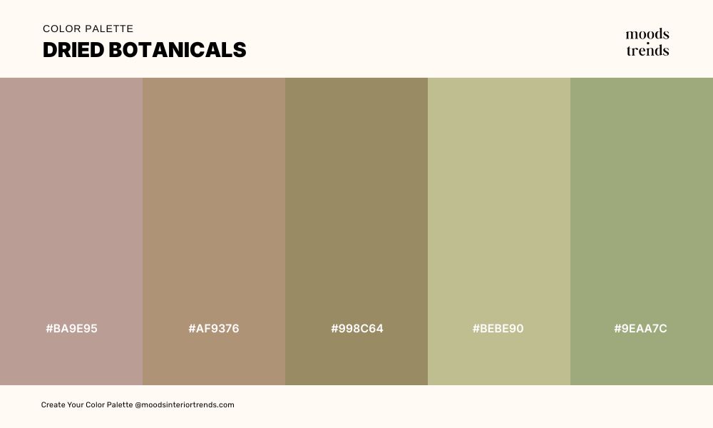
A palette that carries the quiet beauty of things that have passed their peak and become more interesting for it — dusty rose, warm sand, muted khaki, and faded olive tones that feel sun-bleached, organic, and deeply unhurried. These are the colors of pressed herbs, dried lavender, and the kind of Mediterranean terrace where nothing is perfectly maintained and everything is exactly right.
08 Color Palette FROM BLUSH TO FLAME
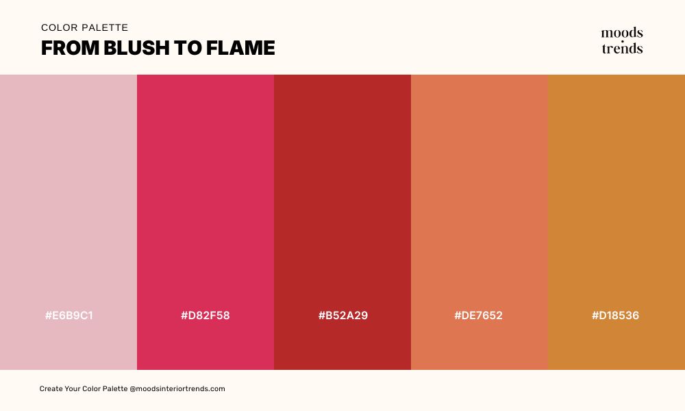
A palette that travels the full distance from delicate to fierce — opening in the softest blush pink before moving through vivid crimson, deep brick, and warm coral into the heat of burnt orange.
09 Color Palette WOODLAND STUDY
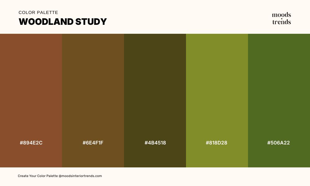
A palette rooted in the deepest, oldest parts of the natural world — warm ambers, dark ochres, and aged browns giving way to the cooler, quieter greens of moss and lichen on ancient stone. These are the colors of old growth forests, dried tree sap, and woodland floors that have never seen direct sunlight, carrying a density and richness that feels genuinely ancient.
10 Color Palette SUGAR MINT
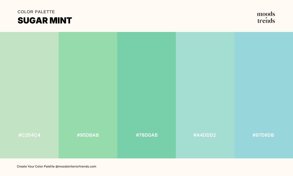
A palette that feels almost weightless — soft mints, pale aquas, and cool celadons so delicate they seem to dissolve at the edges. A fresh, quietly luminous combination that brings airiness and calm to interiors, wellness brands, and editorial design without ever feeling cold or clinical.
11 Color Palette SMOKED PLUM
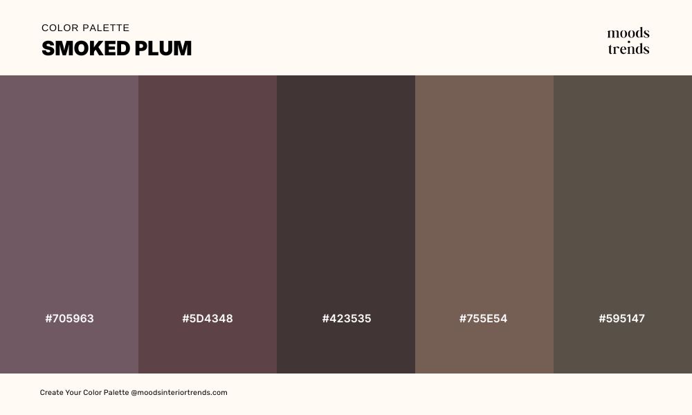
A palette stripped of all brightness and left to deepen into something far more interesting — dark mauves, compressed earth browns, muted olive-grays, and near-black tones that carry the weight of a northern landscape in late autumn.
12 Color Palette WILD WISTERIA
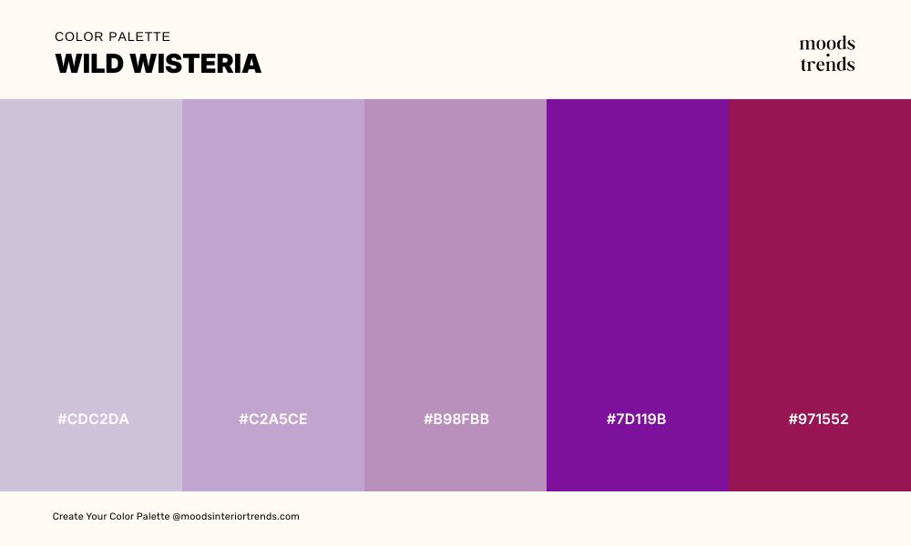
A palette that moves from the softest whisper of pale lavender into the full intensity of deep violet and vivid magenta, tracing the complete emotional range of the purple family in a single sweep. These are the colors of wisteria in peak bloom, carrying a femininity that is confident rather than gentle, dramatic rather than decorative.
13 Color Palette NOIR BOTANICA
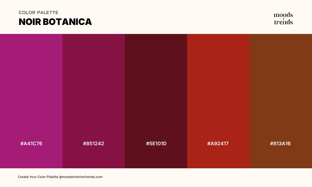
A palette that absorbs light rather than reflects it — deep magentas, dark wines, rich crimsons, and burnt reds anchored by a single note of near-black forest green that holds everything in place like aged velvet drapery against a dark wall.
14 Color Palette SOFT VINTAGE
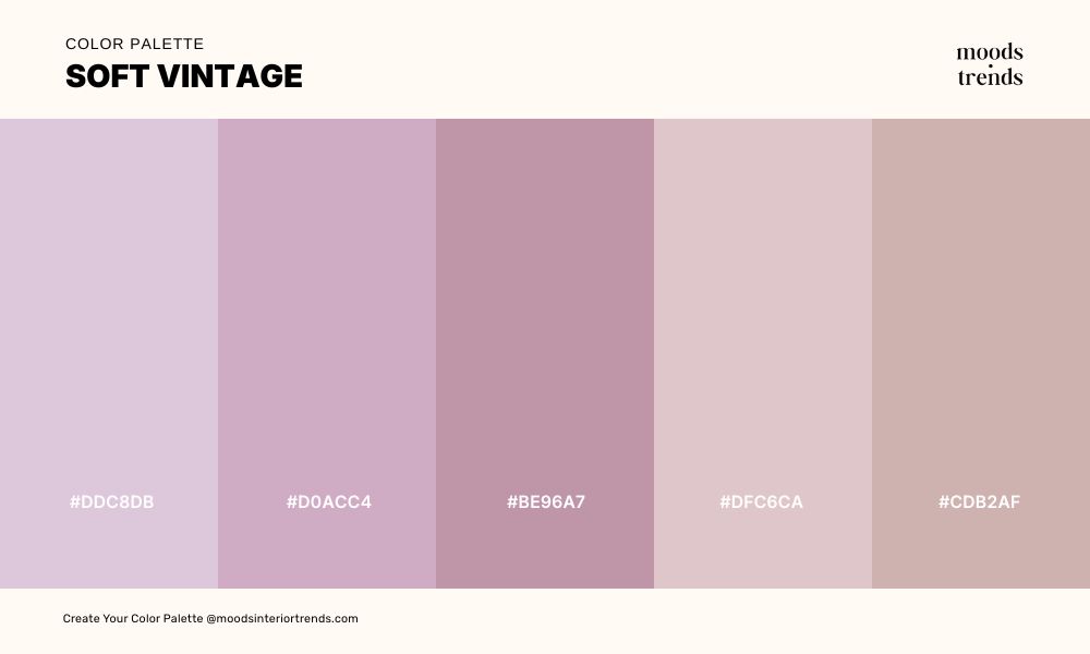
A palette so softly toned it feels like a memory rather than a color scheme — dusty roses, muted lilacs, pale mauves, and warm taupe-pinks that have had all their original intensity gently worn away. These are the colors of flowers dried between the pages of an old book. A deeply refined and nostalgic combination for interiors, lifestyle brands, and editorial design that values subtlety above all else.
15 Color Palette SUN THROUGH LINEN
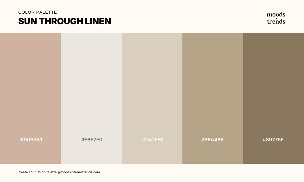
A palette that captures the exact quality of warm light filtered through natural fabric — blush and cream tones carrying the warmth of the light itself.
16 Color Palette ARCTIC SHORE
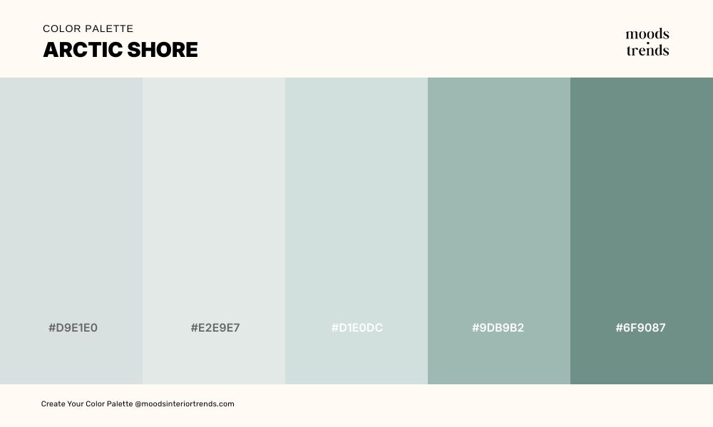
These are the tones of fine ceramic, glacial shorelines, and the particular stillness of a cold morning. Arctic Shore is an exceptionally refined and serene combination for interiors, premium brands, and editorial design that understands restraint as its own form of luxury.
17 Color Palette TROPICAL HEAT
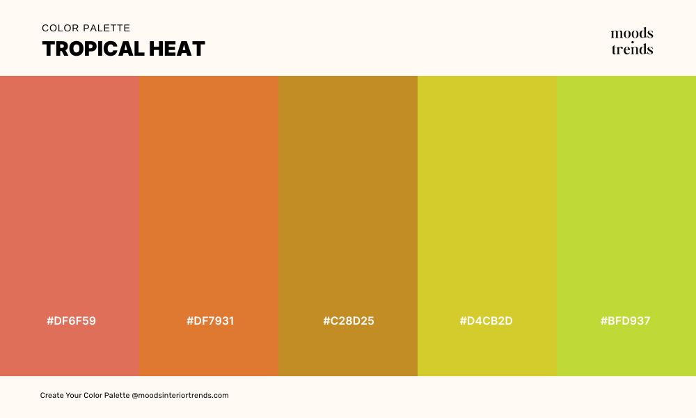
Tropical Heat makes no apologies — vivid coral, burnt orange, and deep amber colliding head-on with the sharp acidity of chartreuse and bright yellow-green in a combination that feels simultaneously tropical, retro, and completely alive.
18 Color Palette FOREST CANOPY
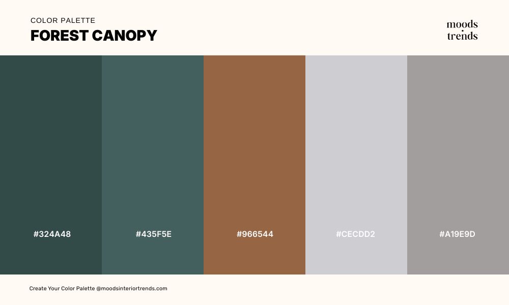
Forest Canopy moves from the deep shadow of the forest floor up into the pale green light breaking through the canopy above — dark teals that trace the full depth of a woodland landscape in a single sequence. These are the colors of moss on stone, lichen on bark, and the particular quality of green light that exists only inside a dense forest on a bright day.
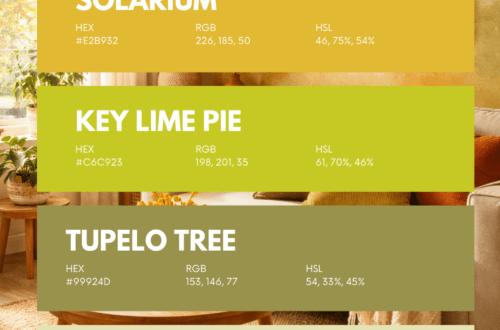
19 Color Palette ATOMIC OPTIMISM
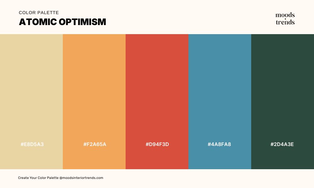
Atomic Optimism channels the confident, forward-looking energy of mid-century design at its most graphic and deliberate — warm straw and burnt tangerine carrying the sunlit optimism of the era, the bold red providing the kind of graphic punch found on vintage travel posters, anchored by dusty teal and deep forest green that bring sophistication and restraint to what could otherwise tip into nostalgia. These are the colors of a 1958 world that believed unreservedly in the future, rendered with enough contemporary restraint to feel entirely relevant today.
20 Color Palette ORGANIC LUXE
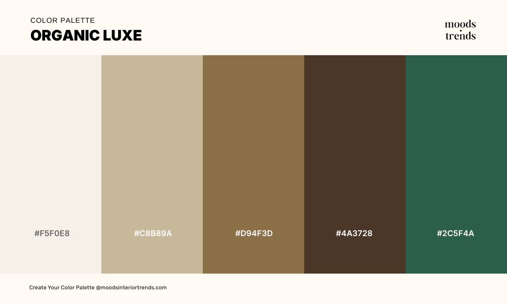
A palette that speaks the language of natural materials elevated to their most considered form — warm ivory and soft sand giving way to aged tan and deep espresso brown, anchored by a single note of rich forest green that lifts the entire combination into something far more intentional.
21 Color Palette SWEDISH MODERN
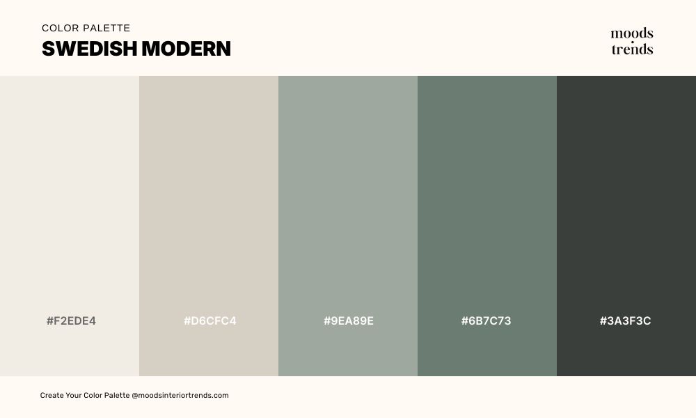
Swedish Modern palette embodies the Nordic design philosophy of doing more with less — warm white and pale greige dissolving gently into dusty sage and deep muted green, anchored by a near-black that gives the whole combination its quiet authority.
22 Color Palette MEDITERRANEAN COASTAL
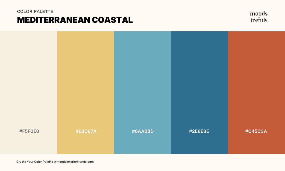
A palette that distills the essential character of the Mediterranean into five tones — sun-bleached ivory and warm gold carrying the heat of the afternoon light, cerulean and deep sea blue evoking the particular intensity of southern coastal water, and terracotta grounding everything in the ochre walls, hand-painted tiles and fired earth of the region itself.
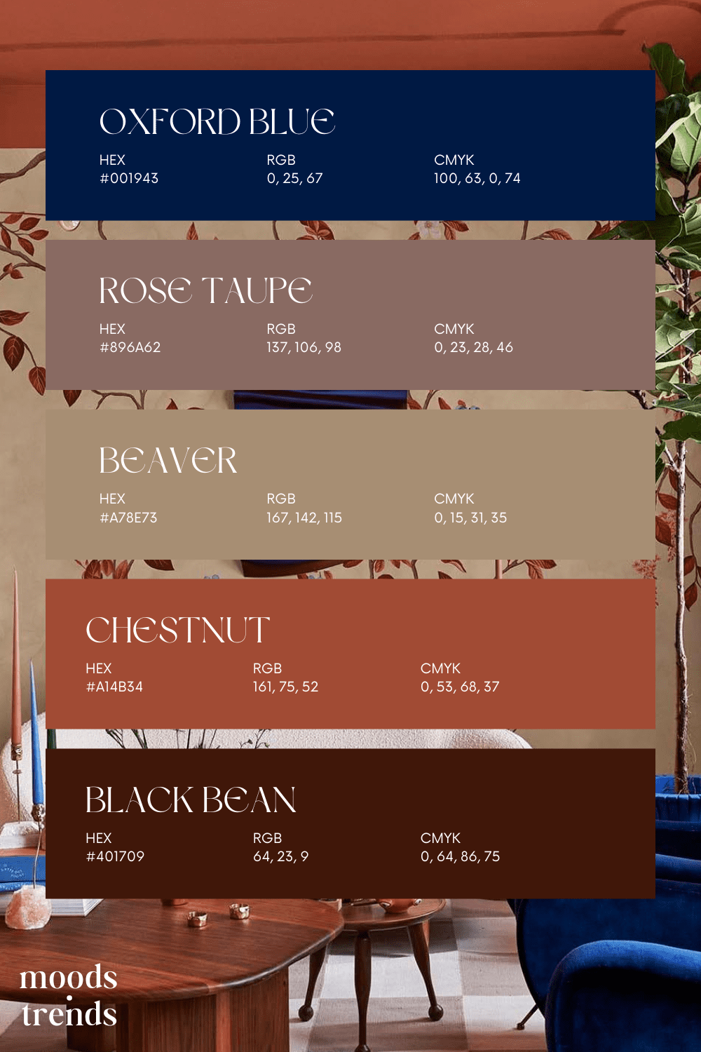
23 Color Palette NEOCLASSICAL
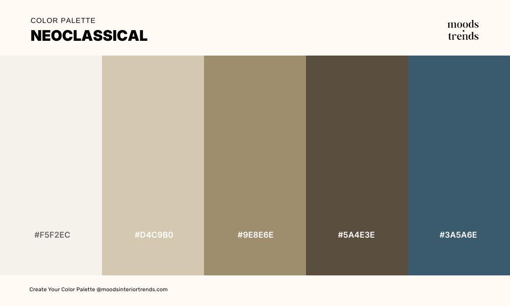
A palette drawn from the material world of classical architecture — cool ivory, warm stone, and aged linen tones that speak of marble, plaster, and the particular quality of light inside a building designed to last centuries. This color combination is deepened by dark umber and a note of Prussian blue that carries the weight of antiquity.
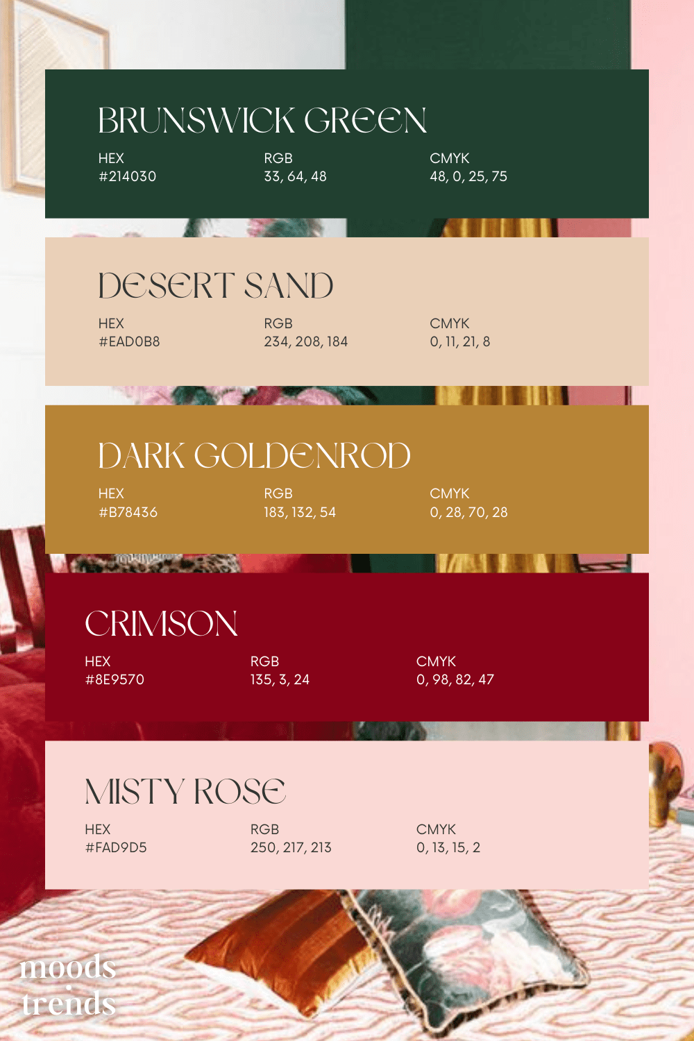
24 Color Palette GOBLINCORE
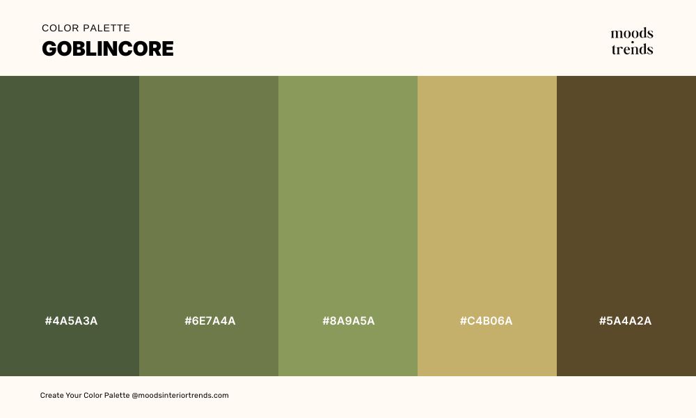
A palette that embraces the damp, verdant, and deliberately unpolished beauty of the forest floor — deep moss, muted fern, and aged olive greens anchored by dark earth brown and a note of weathered gold that suggests something precious found rather than bought.
25 Color Palette GOLDEN HOUR
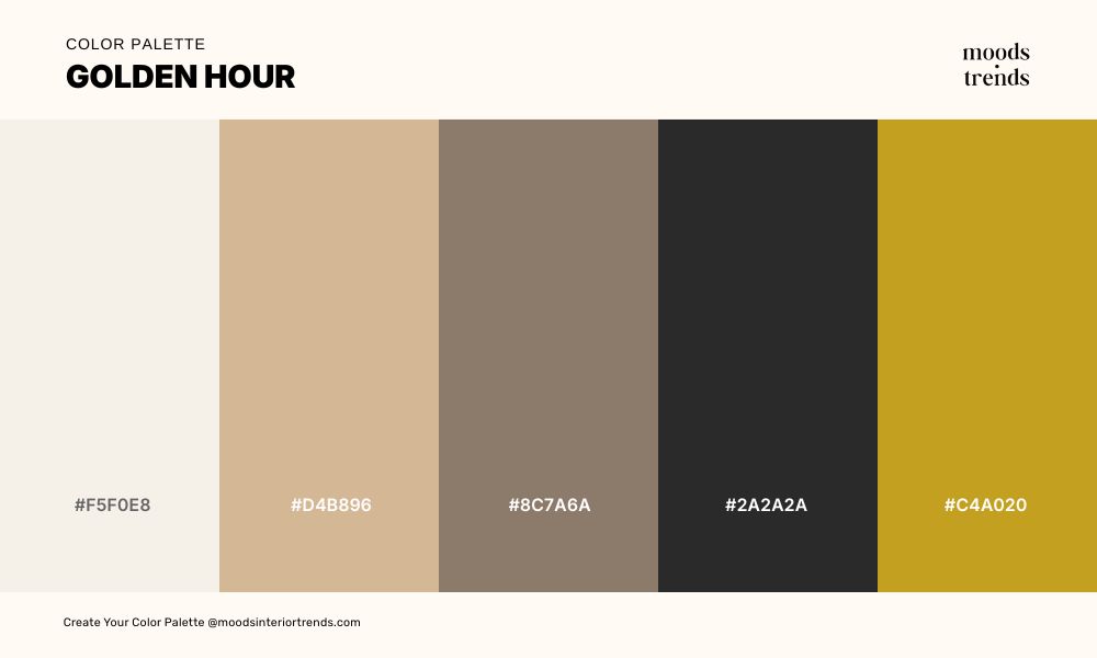
A warm, nostalgic palette that captures the soft glow of sunlight as it fades into evening.
Muted creams and sandy tones blend seamlessly with earthy browns, evoking calm and quiet elegance.
26 Color Palette BOHO CHIC
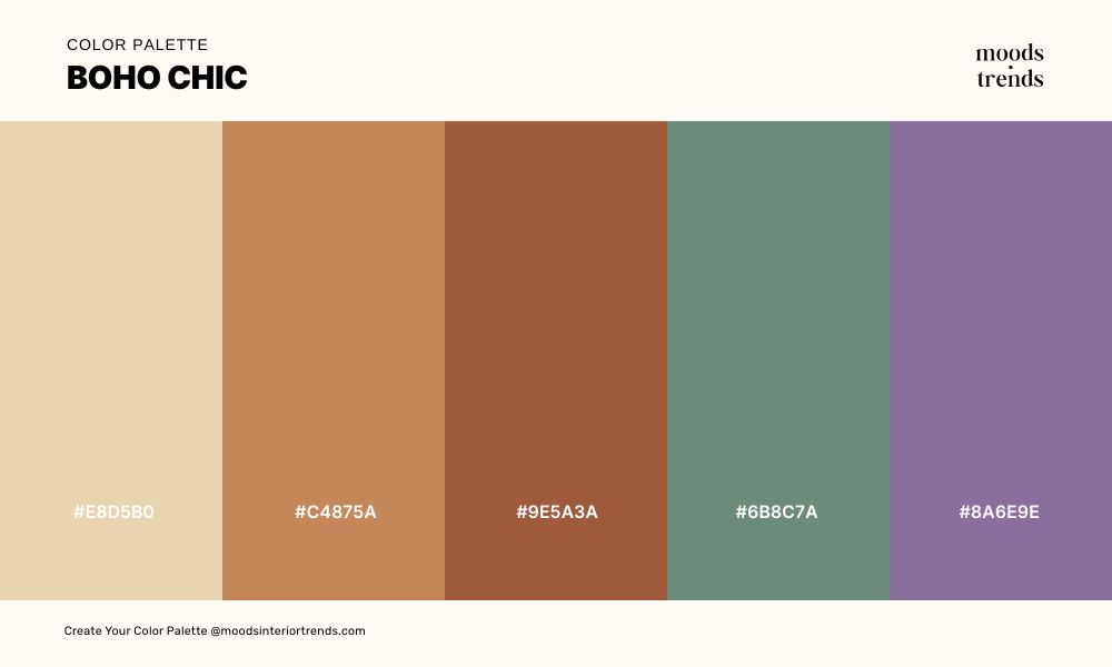
An earthy, free-spirited palette that blends sun-washed neutrals with rich terracotta tones. Hints of dusty lavender add a subtle artistic twist, capturing the essence of bohemian elegance.
27 Color Palette THE WITCHING HOUR
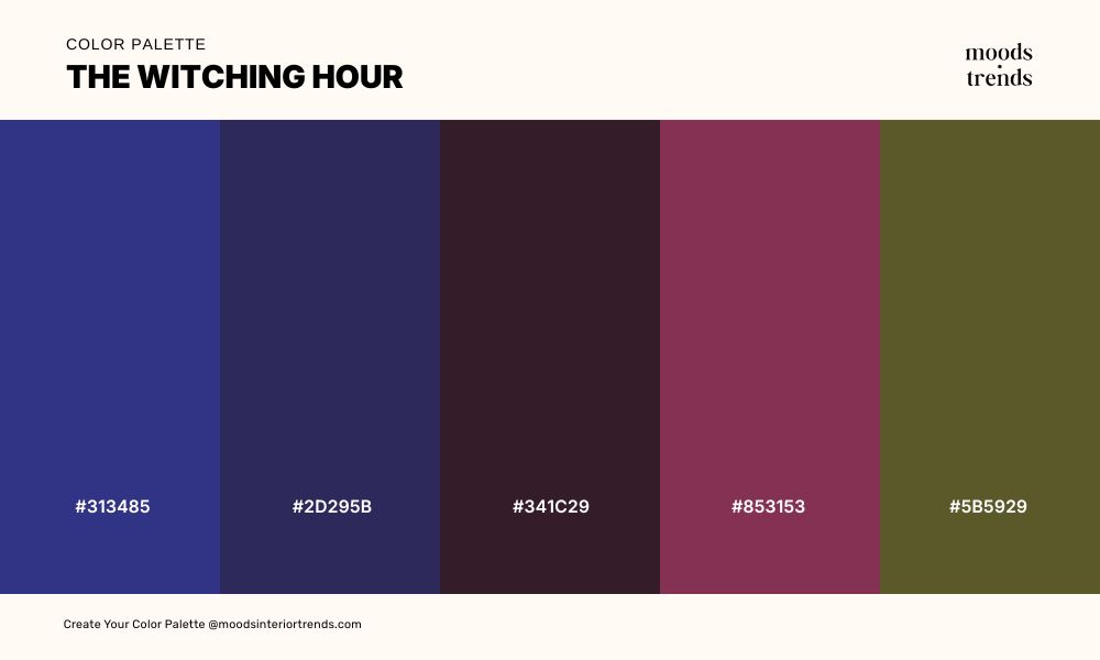
A dark, mysterious palette where deep indigo and shadowy violet set an enchanting, nocturnal mood.
Rich burgundy and muted plum tones evoke ritual, secrecy, and quiet intensity. An earthy olive undertone grounds the palette.
28 Color Palette FORAGED & FOUND
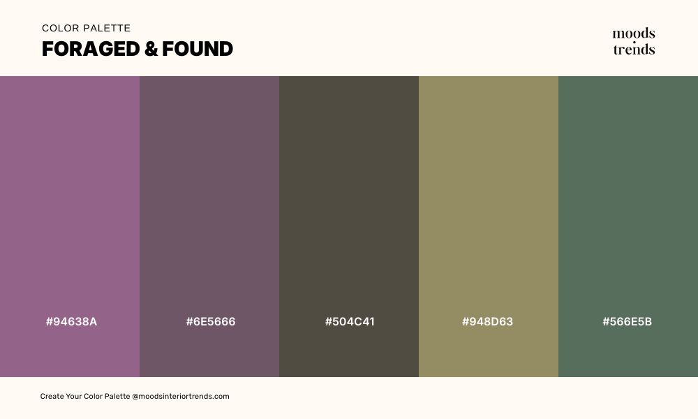
An organic, quietly layered palette that feels gathered rather than designed, where softened lavender, mossy greens, and weathered neutrals echo the calm richness of the natural world. Each tone carries a sense of age and texture. The overall effect is grounded, evoking the beauty of things foraged, worn, and thoughtfully kept.
29 Color Palette SPRING MIST
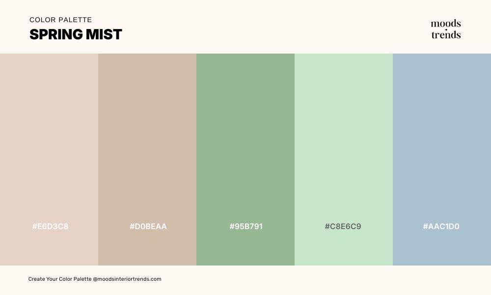
Spring Mist is a soft, atmospheric palette that captures the quiet stillness of early spring, where petal pinks, misty blues, and muted greens dissolve gently into one another. Subtle and serene, the palette carries a sense of renewal.
30 Color Palette DARK VINTAGE
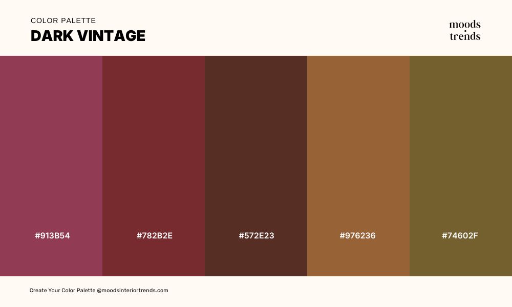
A richly nostalgic palette steeped in shadow and warmth, where deep wine, aged mahogany, and burnished copper tones evoke a sense of history and quiet opulence. The colors feel worn in the most intentional way. There’s a subtle glow beneath the darkness, giving the palette a refined, cinematic quality that feels both intimate and enduring.
31 Color Palette TROPICAL DEPTHS
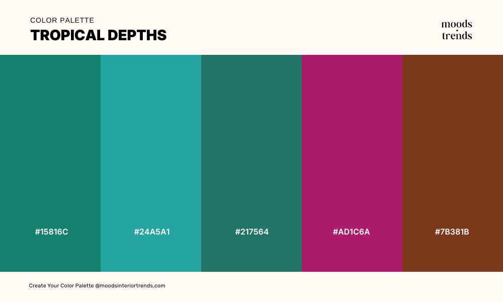
A lush, immersive palette that channels the hidden layers of tropical landscapes, where deep teal and aquatic greens suggest shadowed water and dense foliage. Vibrant turquoise and magenta bring flashes of exotic life, like blooms and marine forms emerging from the depths.
32 Color Palette WILDFLOWER EDGE
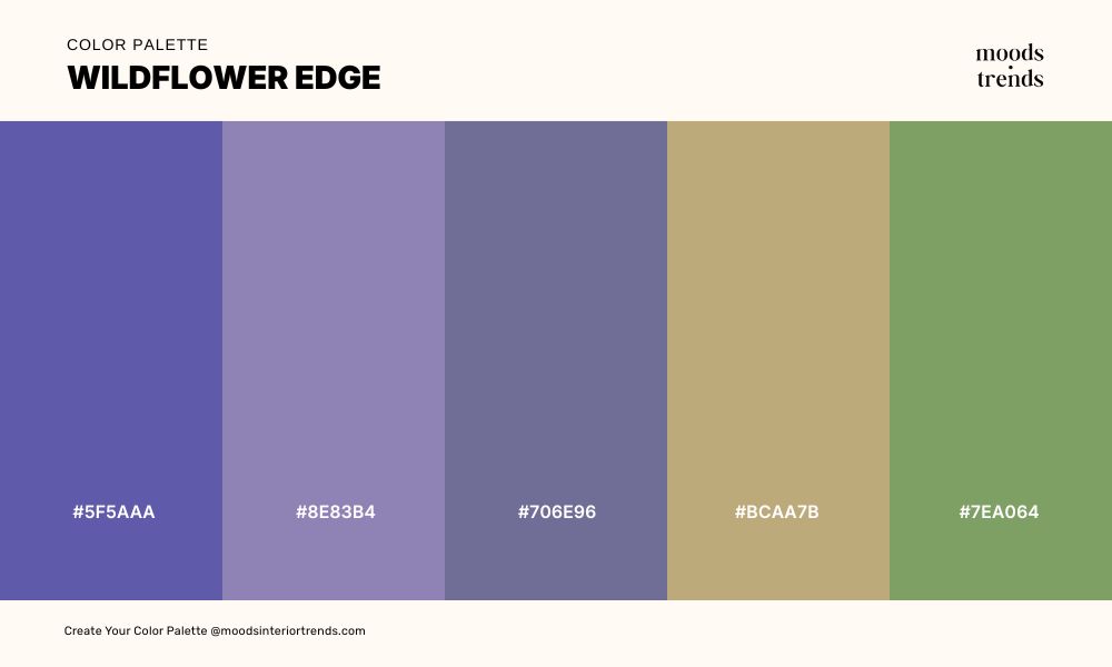
A softly untamed palette that feels like the meeting point between meadow and shadow, where dusky violets and faded periwinkle carry a quiet, windswept elegance.
33 Color Palette MINERAL ESPRESSO
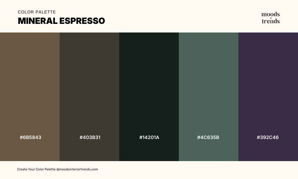
A grounded, tactile palette inspired by natural minerals and dark roasted espresso, where rich browns and deep charcoals create a sense of warmth and solidity. The result is a moody, contemplative palette that feels both earthy and refined.
34 Color Palette THE GENTLE PALETTE
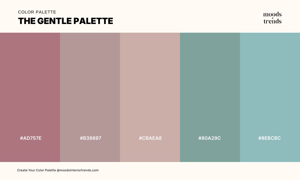
The Gentle Palette is a soothing and tender color combination of muted roses and warm mauves that drift effortlessly into lavender and powdery teal. These colors carry a quiet optimism, like morning light filtering through sheer curtains, subtle but comforting. It’s a palette that invites calm and reflection.
35 Color Palette MARKET DAY
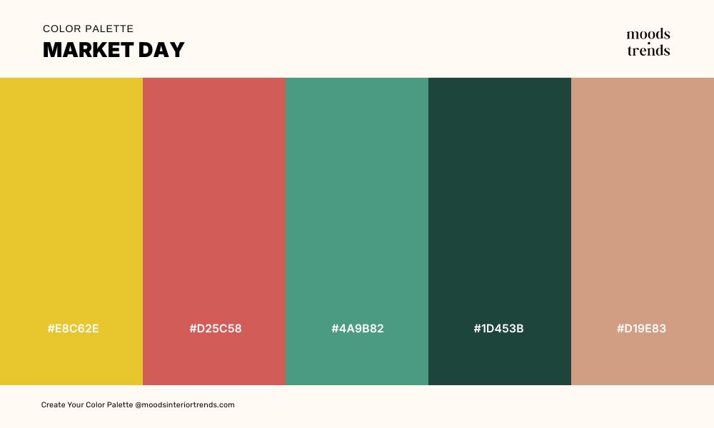
Market Day captures the energy of a lively market, where golden yellows and fiery corals spark excitement and movement. Deep teal and forest tones anchor the composition, grounding the brightness with earthy balance. Hints of warm sand bring subtle harmony, evoking the textures and colors of goods laid out under the sun.
36 Color Palette SOFT SEDIMENT
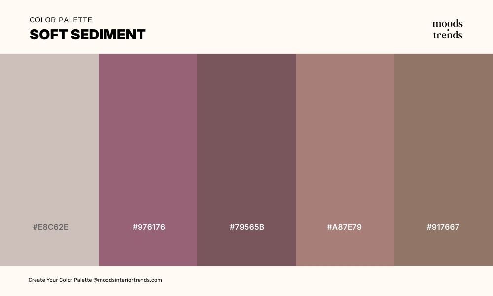
This color palette feels like layers of stone and soil worn smooth over time, where soft taupes and dusty rose tones evoke natural calm. Deeper mauves and muted browns add subtle weight, the overall effect is gentle and contemplative, like a landscape shaped by patience and stillness.
37 Color Palette FLORIST´S TABLE
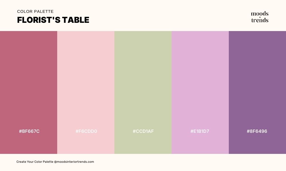
A romantic, floral-inspired palette that feels like a sunlit florist’s table, where soft pinks and lavender hues mingle with delicate greens and creamy neutrals. Vibrant magenta and deep mauve accents add a lively, playful energy, like blooms freshly arranged.
38 Color Palette SEA SAGE
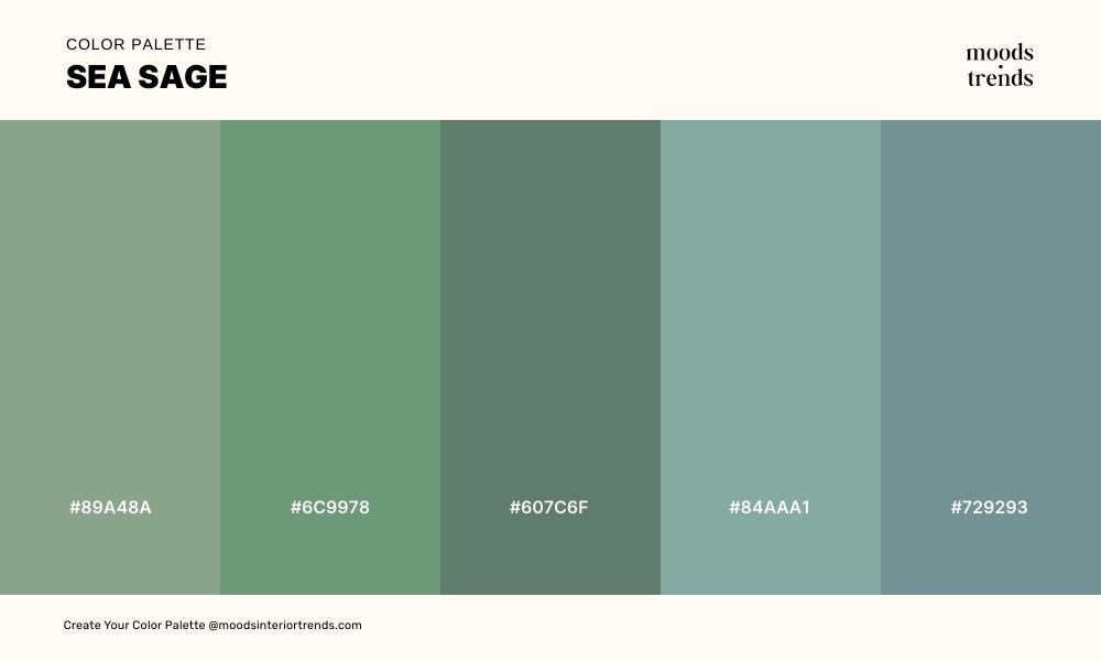
A serene, coastal-inspired palette where muted greens and soft teals evoke the calm of sage-scented shores and gentle sea breezes. Stone-gray and misty blue tones add depth and quiet balance, like weathered rocks along the water’s edge. The overall effect is soothing and contemplative, capturing the understated elegance of nature by the sea.
39 Color Palette ADOBE & DUST
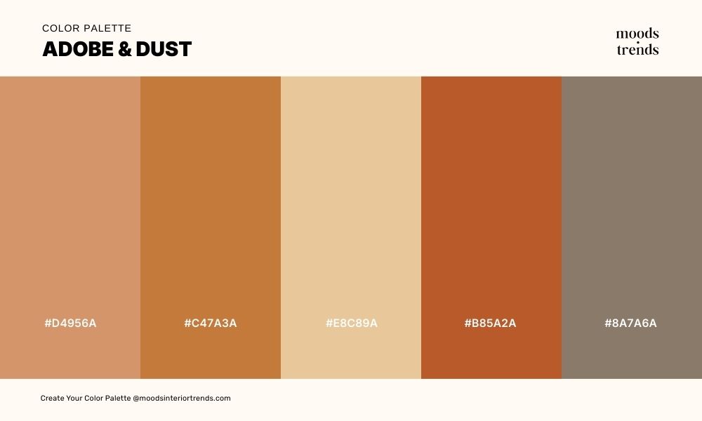
A warm, earthy palette that evokes sunbaked adobe walls and the subtle textures of desert dust. Rich terracotta and burnt sienna mingle with sandy neutrals, creating a sense of rustic charm and grounded warmth. Soft, muted browns tie the composition together, giving the palette a timeless, natural elegance.
40 Color Palette SILVER SILENCE
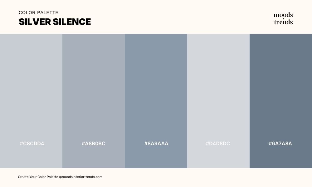
Soft grays and muted blues evoke calm reflections on still water. The overall impression is serene and contemplative, like a moment of silence captured in color.
41 Color Palette GILDED HOUR
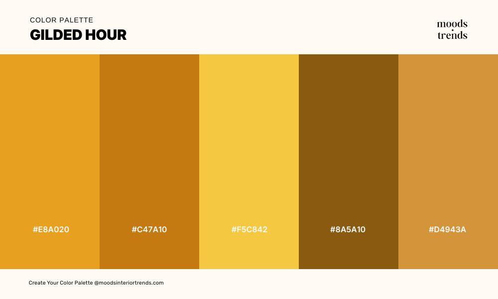
A luminous, radiant palette that glows with the warmth of late afternoon sunlight, where rich golds and amber tones catch the eye like fleeting rays. Deep burnt oranges and warm ochres add depth and a hint of drama, grounding the brilliance with earthy elegance. The overall effect is vibrant and opulent, evoking the fleeting magic of a gilded hour.
42 Color Palette FROZEN ROSE
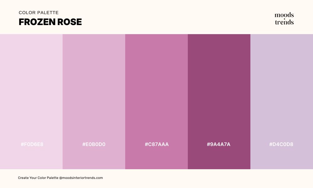
A delicate, frosted palette that balances icy pastels with deeper, velvety pinks, evoking the elegance of roses touched by winter’s chill. Soft lavender-pinks and pale mauves create a gentle, ethereal atmosphere, while richer magentas and berry tones add warmth and depth. The result is romantic and refined, like a bloom preserved in frost.
43 Color Palette THE ABYSS
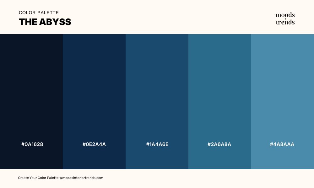
A deep, immersive palette that draws the eye into shadowed waters, where midnight blues and inky indigos evoke the vast mystery of the ocean’s depths. Gradations of teal and cerulean ripple through the composition, adding movement and subtle luminosity. The overall effect is both powerful and contemplative, like staring into an endless, serene abyss.
44 Color Palette VENETIAN JEWEL
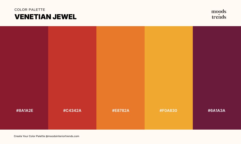
A dramatic, opulent palette that glimmers like treasures in a Venetian palace, where deep crimson and ruby tones exude richness and passion. Fiery oranges and golden yellows add warmth and vibrancy, creating a sense of movement and light. The overall effect is bold and luxurious, evoking the allure of gilded canals and jewel-toned grandeur.
45 Color Palette CONCRETE POETRY
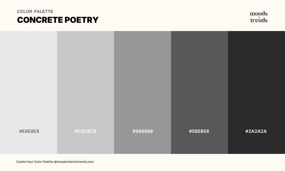
A minimalist, urban palette that captures the stark beauty of cityscapes, where soft grays fade into bold charcoals and deep black. The progression from light to dark evokes structure, shadow, and rhythm. It’s a restrained, contemplative palette that feels modern, architectural and powerful.
46 Color Palette CLOUD NINE
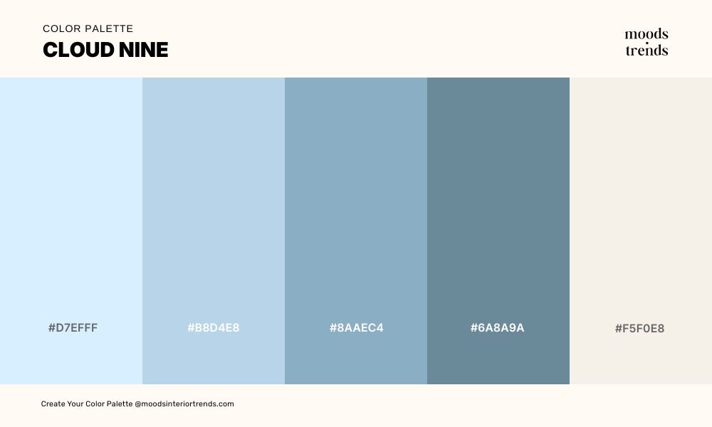
Cloud Nine is a light, airy palette that feels like drifting through a sky of soft clouds, where pale blues and gentle teals create a serene, uplifting atmosphere. Hints of muted gray-blue add subtle depth, while creamy off-whites bring warmth and balance. The overall effect is dreamy and peaceful, evoking calm, effortless serenity.
47 Color Palette JADE LINEN
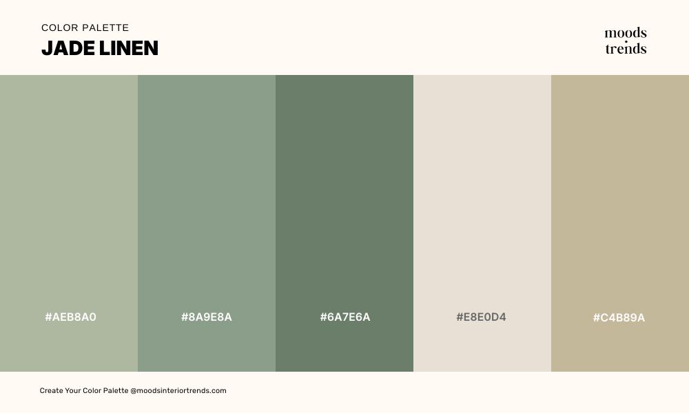
Gentle jade and sage tones mingle with creamy beiges, creating a sense of quiet harmony and grounded simplicity. The overall effect is soothing and refined, like a sunlit room filled with natural textiles and subtle greenery.
48 Color Palette PLUM DESCENT
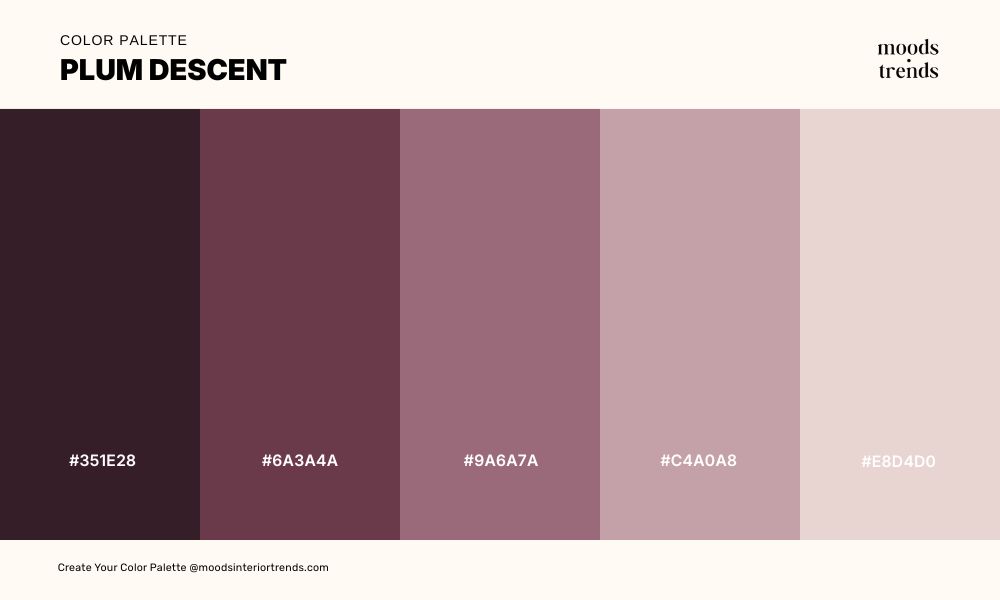
A moody, introspective palette where deep plum and rich burgundy cascade into softer mauves and muted pinks, evoking the gradual fading of twilight. Subtle grayish tones add quiet balance, softening the intensity and lending a contemplative air. The overall effect is elegant and poetic, like the slow descent of color at day’s end.
49 Color Palette WASABI GARDEN
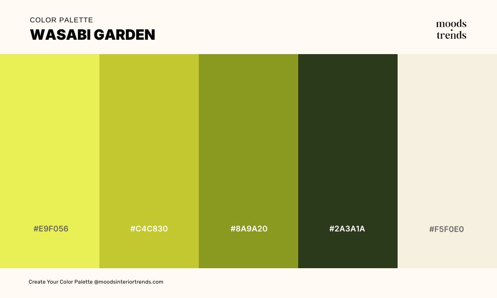
A vibrant, unexpected palette that bursts with the sharp freshness of spring greens, where bright chartreuse and mustard tones evoke the energy of a flourishing garden. The overall effect is lively, playful, and surprisingly harmonious, like nature’s boldest flavors in perfect balance.
50 Color Palette PERSIMMON DUSK
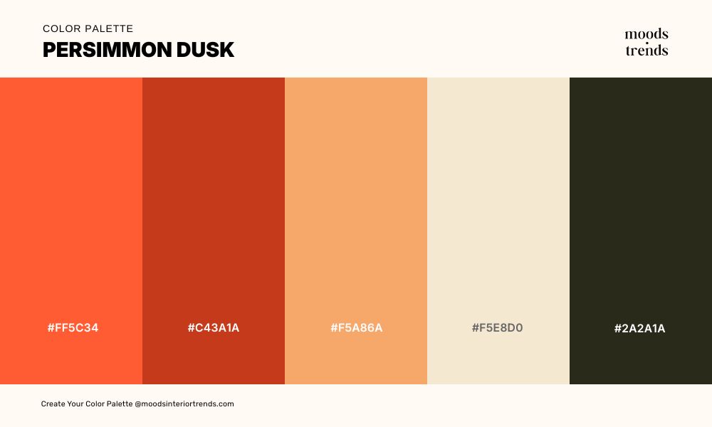
A warm, evocative palette that captures the fleeting glow of sunset, where vibrant persimmon and fiery coral fade into soft apricot and creamy sand tones. Deep charcoal completes the composition, adding contrast and a hint of mystery. The overall effect is rich and emotive, like the sky just before nightfall, glowing with warmth and quiet intensity.
Building Your Own Combinations
The palettes above are a starting point, not a prescription. The most resonant color decisions are the ones made with a specific context, mood, and audience in mind.
Moods & Trends offers a suite of tools designed to support exactly this kind of intentional color work — from generating harmonious palettes to extracting colors from reference images, checking contrast accessibility, and exploring tints and shades. Whether you are working on an interior project, a brand system, or a digital product, the right palette is closer than you think.