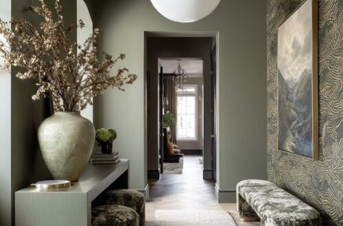
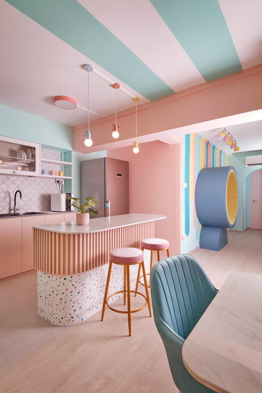
In the realm of interior design, color holds a profound significance. It’s not merely about aesthetics; it’s about creating moods, enhancing spaces, and evoking emotions. Among the myriad of color palettes available, pastels stand out for their soft, gentle hues that bring a sense of tranquility and sophistication to any space.
Color plays a pivotal role in interior design, influencing the ambiance and atmosphere of a room. Whether it’s a vibrant shade that energizes or a muted tone that soothes, the right color palette can transform a space completely. Pastel color palettes, in particular, offer a subtle yet impactful way to infuse elegance and charm into interiors.
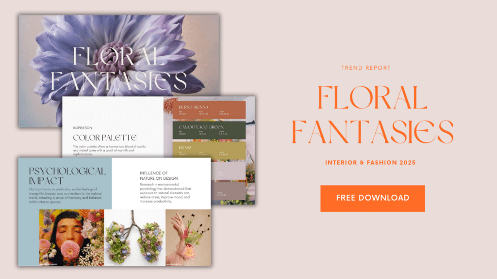
This color palette is part of the Floral Fantasies Report that you can download for free by clicking below:
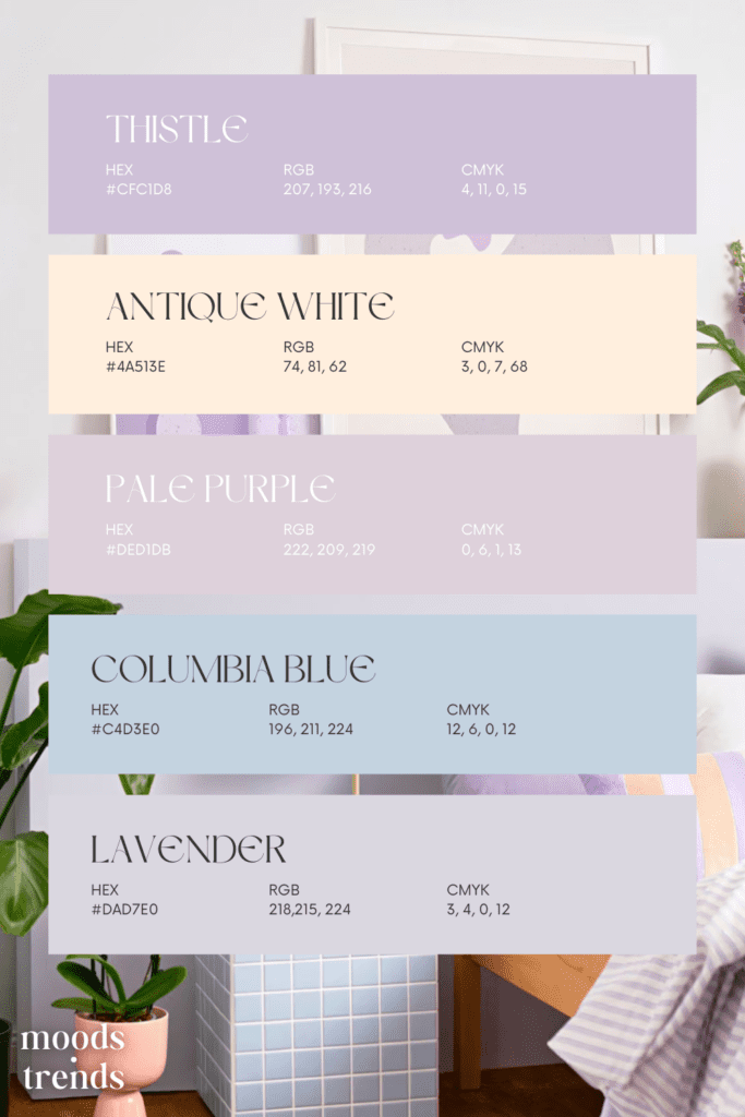
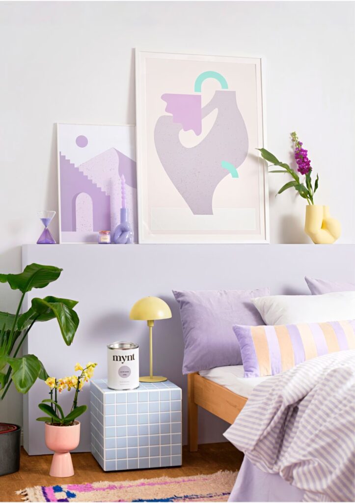
Soft Neutrals: Lavender and Purple Undertones
Delicate pastels come together in this enchanting palette, featuring shades of thistle, antique white, pale purple, columbia blue, and lavender. These soft, ethereal shades create a tranquil and dreamy ambiance, perfect for imbuing any space with a sense of serenity and grace.
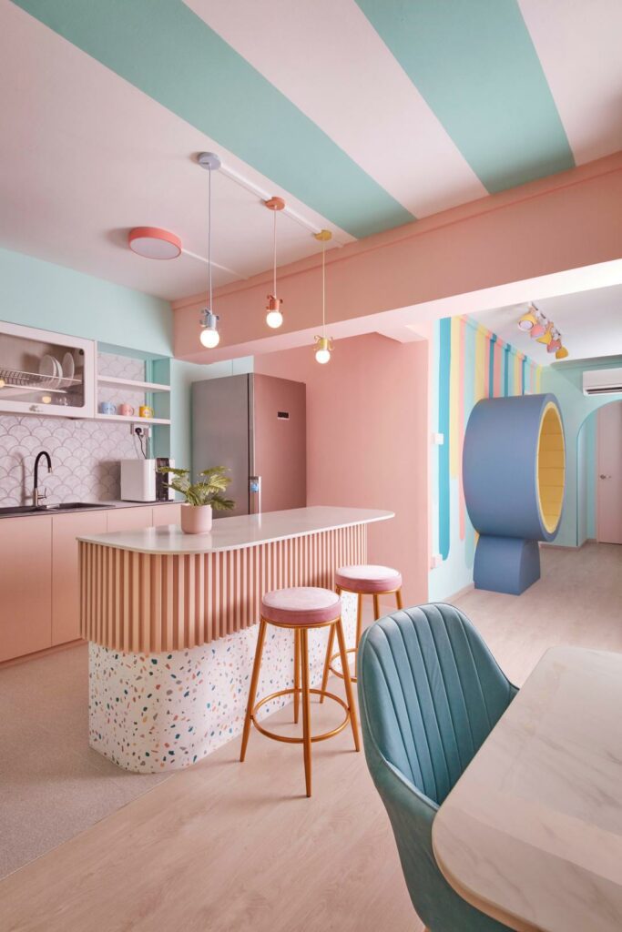
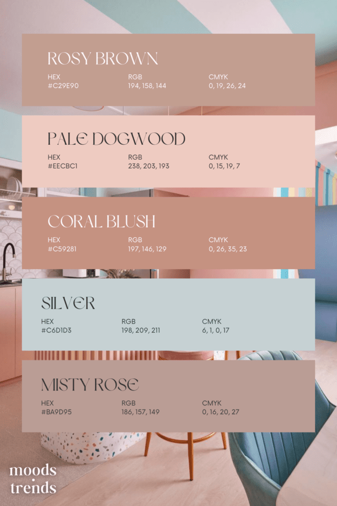
Romantic Blush: Soft Pinks and Mauves
Blush tones add a romantic touch to any space. Soft pinks and mauves infuse warmth and femininity, creating a cozy and inviting atmosphere. Whether used as accents or as the main color scheme, these colours bring a sense of softness and elegance to interiors.
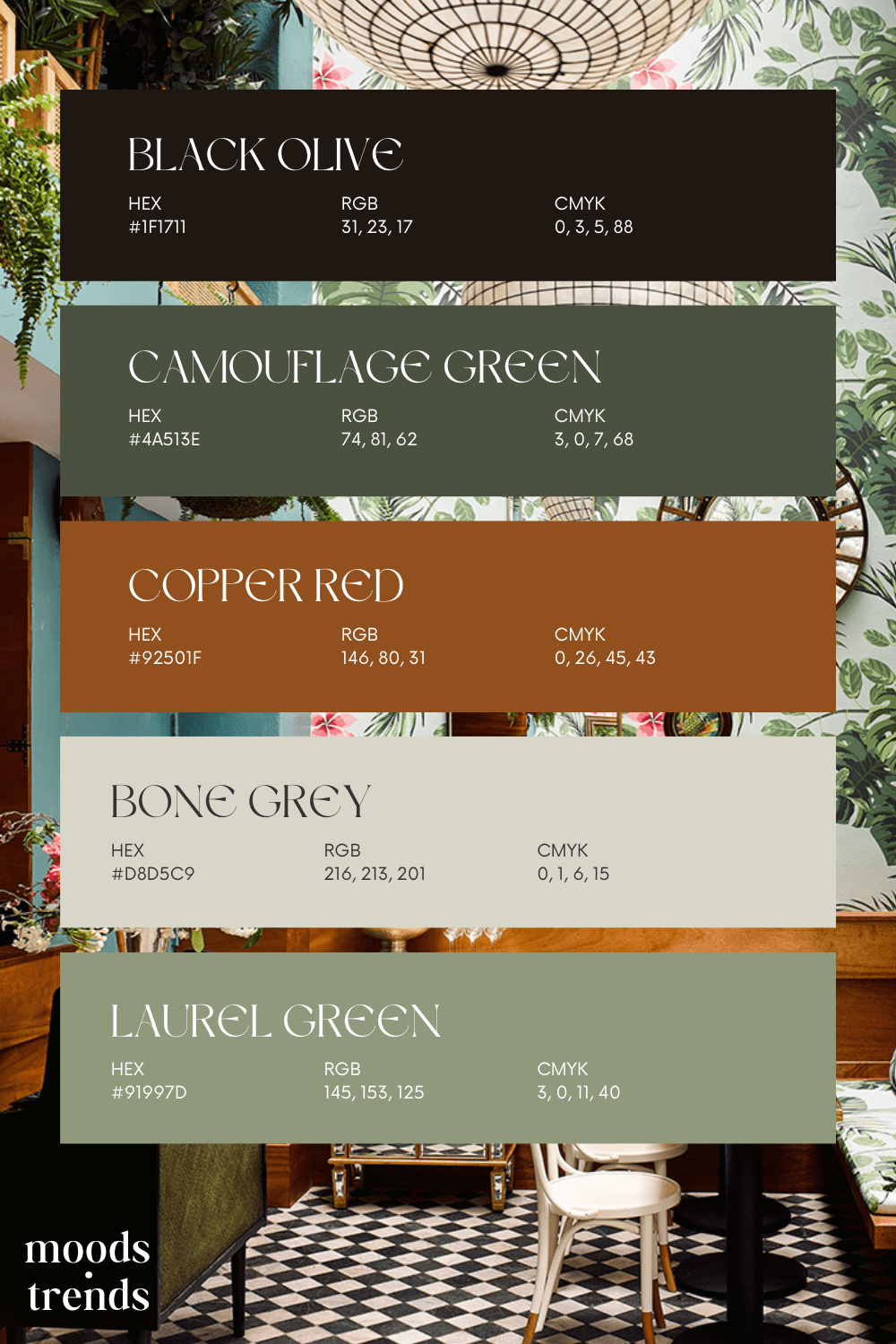
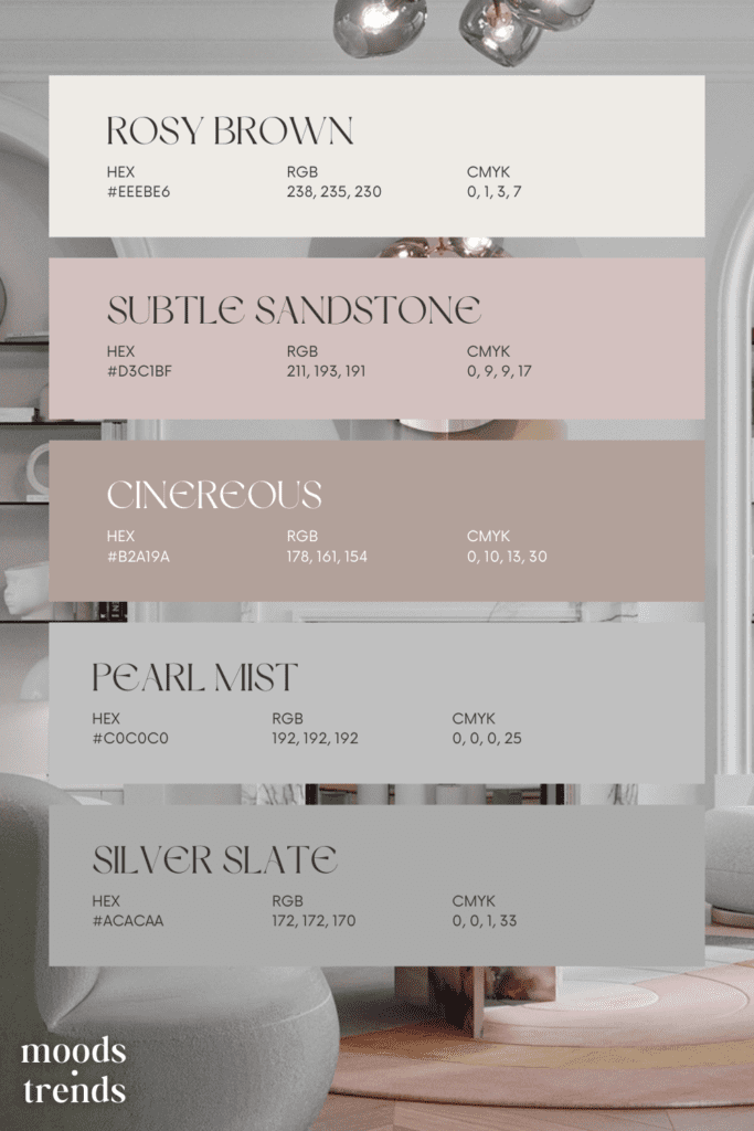
Tranquil Greys: Creams, Beiges, and Grays
Soft neutrals form the foundation of many pastel color palettes. These understated shades create a serene backdrop that allows other elements in the room to shine. Creams, beiges, and grays provide a timeless appeal, offering versatility and sophistication.
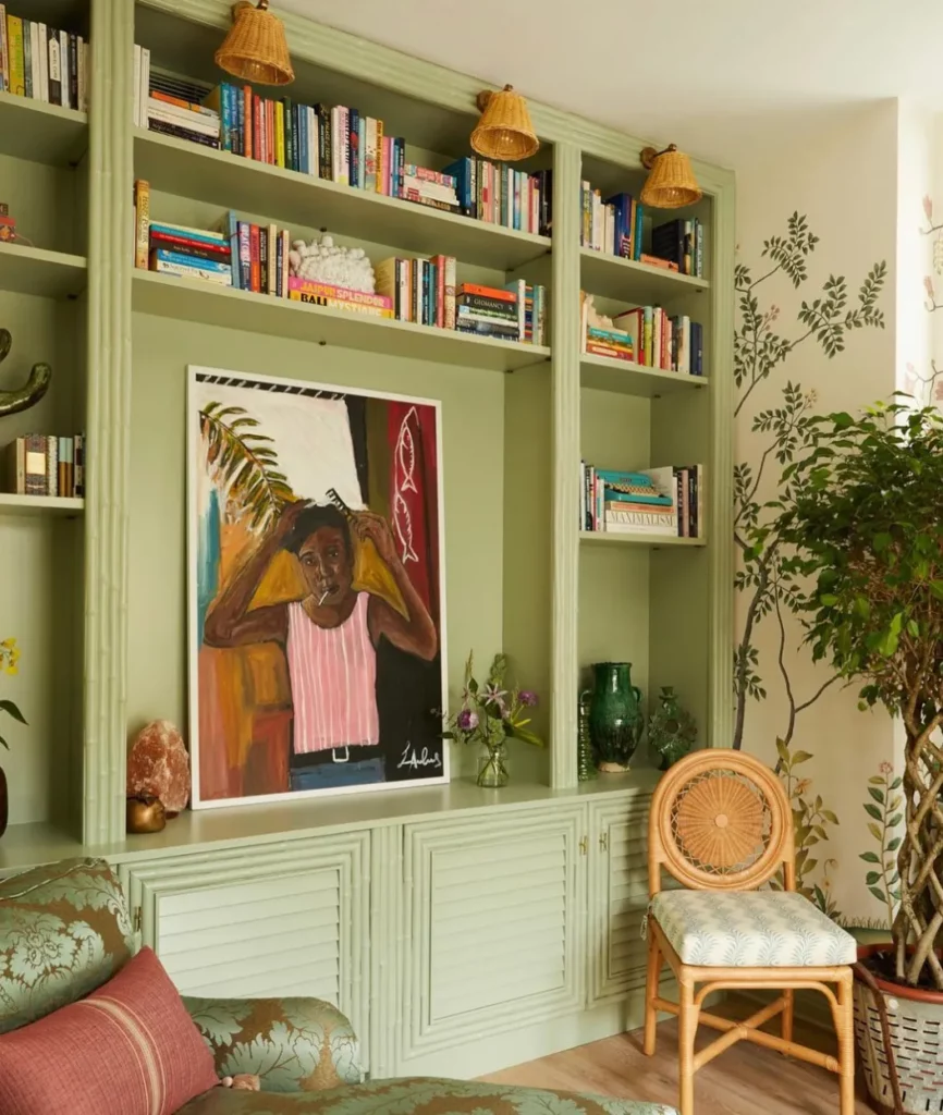
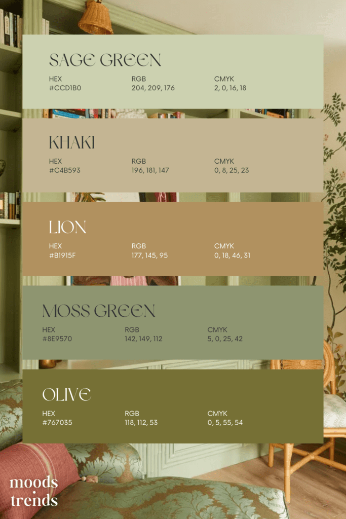
Gentle Greens: Mint and Sage
Green symbolizes growth, harmony, and renewal, making it a popular choice for interior spaces. Pastel greens like mint and sage bring a sense of freshness and vitality to a room, creating a connection to nature and the outdoors.
Tips for Incorporating Pastels into Your Design
Incorporating pastel color palettes into your design doesn’t have to be daunting. Here are some tips to help you seamlessly integrate these soft hues into your interiors:
- Balance with neutrals: Pair pastel colors with neutral tones like white, beige, or gray to create a harmonious balance.
- Layer textures: Add depth and interest to your space by incorporating a variety of textures, such as linen, velvet, or wicker.
- Use accents wisely: Introduce pastel colors through accent pieces like throw pillows, artwork, or rugs for a subtle pop of color.
- Consider lighting: Pay attention to natural and artificial lighting in your space, as it can affect how pastel colors appear.
Whether you prefer soft neutrals, romantic blush tones, tranquil blues, gentle greens, or sunny yellows, there’s a pastel palette to suit every taste and style. By incorporating these soft hues into your design, you can create spaces that are both elegant and inviting, providing a serene sanctuary for living, working, and entertaining.
*Like what you’ve read? Feel free to share on your social media! If you want to see more articles click here.*| Don’t forget to follow us on our social media, Instagram, Pinterest and Youtube.