In the world of interior design and decoration, color is a powerful tool. It can transform a room, set a mood, and evoke emotions. The art of choosing the right colors for a space goes beyond mere aesthetics; it delves into the fascinating realm of color psychology.
By understanding how trending hues impact our emotions, designers and homeowners can create spaces that are not only visually pleasing but also deeply satisfying on an emotional level.
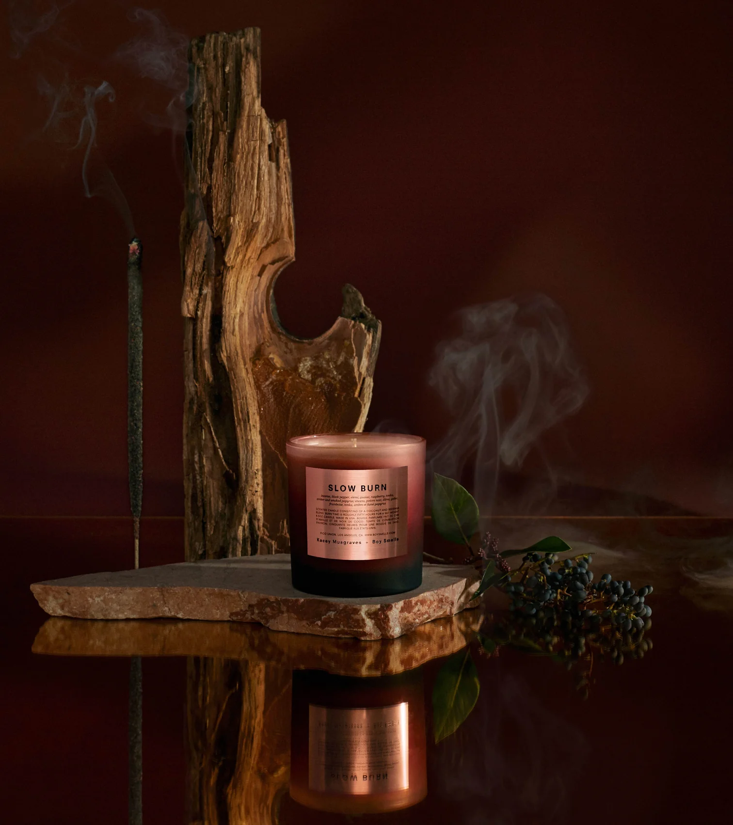
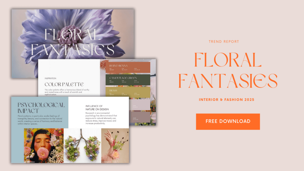
This color palette is part of the Floral Fantasies Report that you can download for free by clicking below:
The Essence of Color Psychology
Color psychology is the study of how colors affect human behavior, mood, and emotions. It has a significant influence on our perception of spaces, making it a crucial element in interior design. Colors can communicate a wide range of emotions and can be used strategically to create different atmospheres within a room.
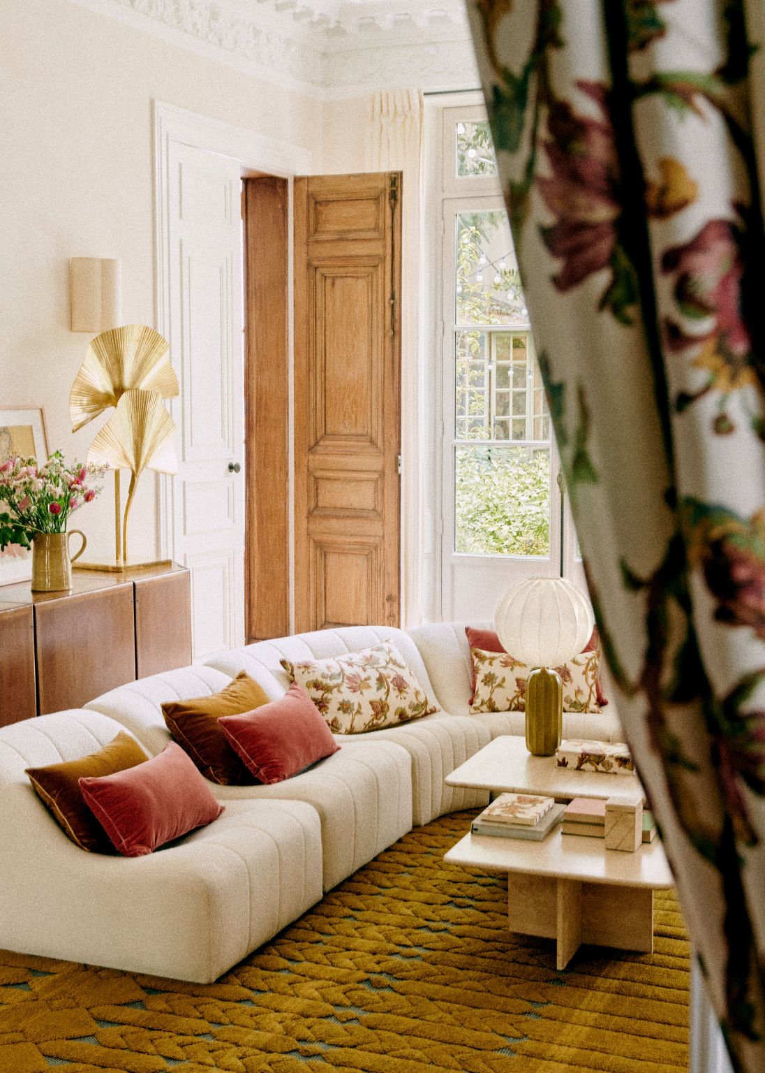
One of the first principles in color psychology is the concept of warm and cool colors. Warm colors like reds, oranges, and yellows are associated with energy, warmth, and passion. They can make a room feel cozy and inviting, making them popular choices for living rooms and dining areas.
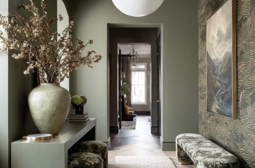
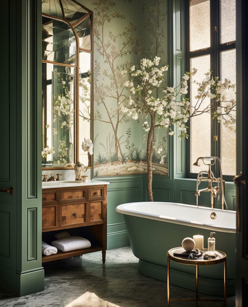
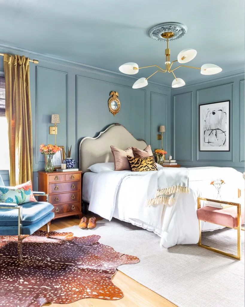
In contrast, cool colors such as blues, greens, and purples tend to be calming and soothing, making them suitable for bedrooms, bathrooms, and offices.
Colors can affect our mood, energy levels, and even our cognitive abilities.
Read More: Dopamine Decor: Rethinking Color Trends in Interior Design
Color Symbolism: Decoding the Messages
To fully understand how color psychology operates in design, one must delve into color symbolism. Different cultures and contexts attach unique meanings to colors, and these associations can heavily influence the emotional impact of a space.
For example, in Western culture, red is often associated with love, passion, and energy, making it a popular choice for romantic settings. In contrast, white symbolizes purity, innocence, and cleanliness, often seen in hospital rooms and minimalist designs.
In Asian cultures, red is a symbol of luck and prosperity, while in some parts of Africa, it represents death and mourning. The power of color symbolism transcends borders and speaks to our primal instincts.
When choosing colors for interior decoration, it’s essential to consider the cultural and personal connotations that different hues may carry.
Impact of Color Psychology in Interiors
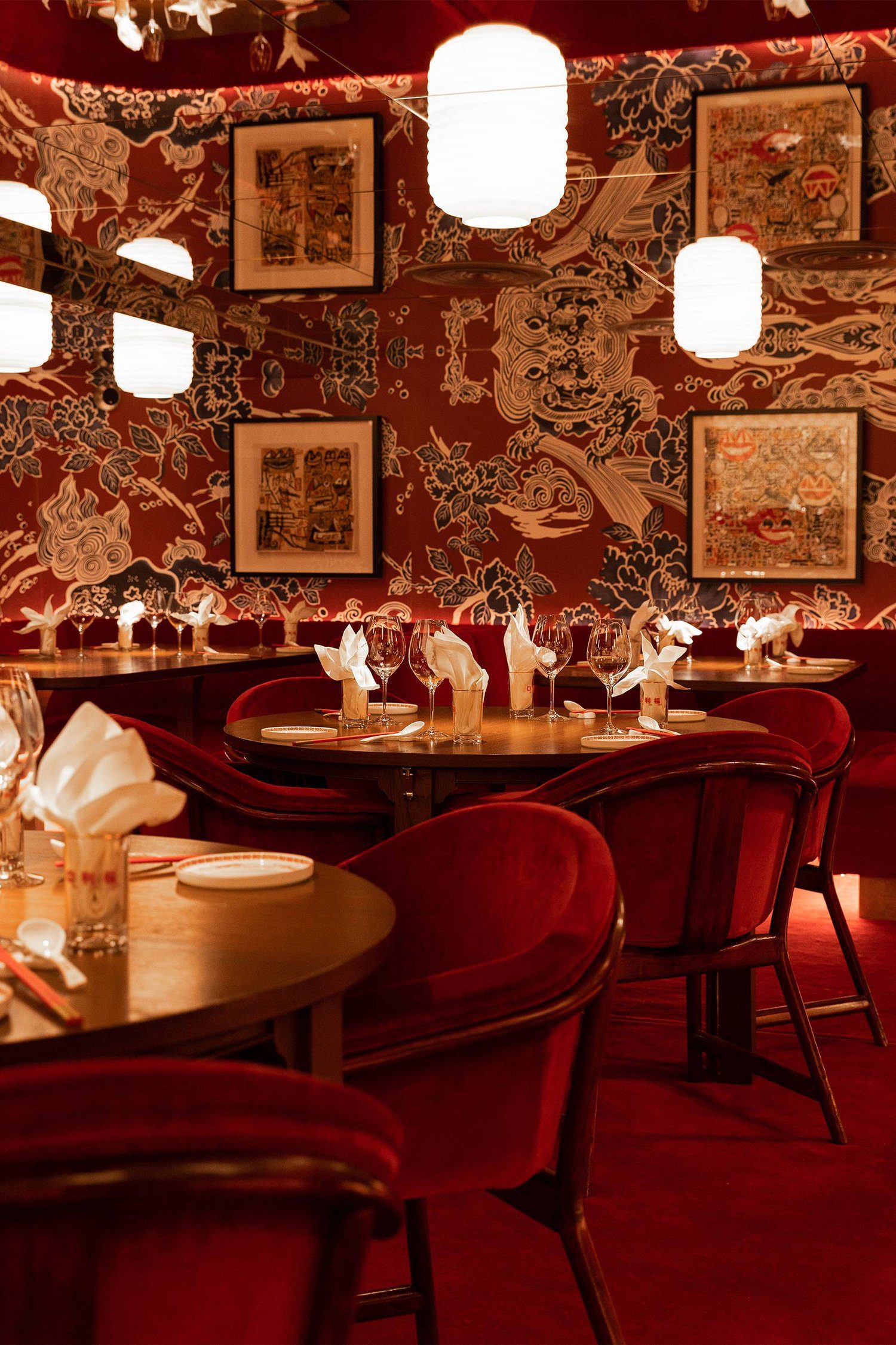
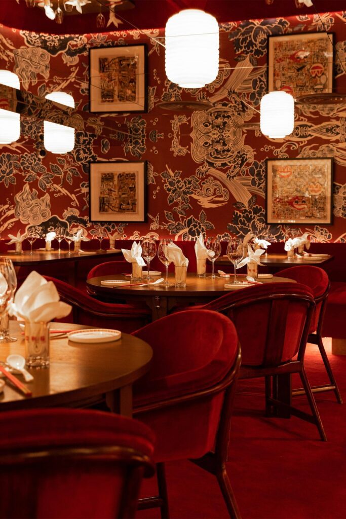
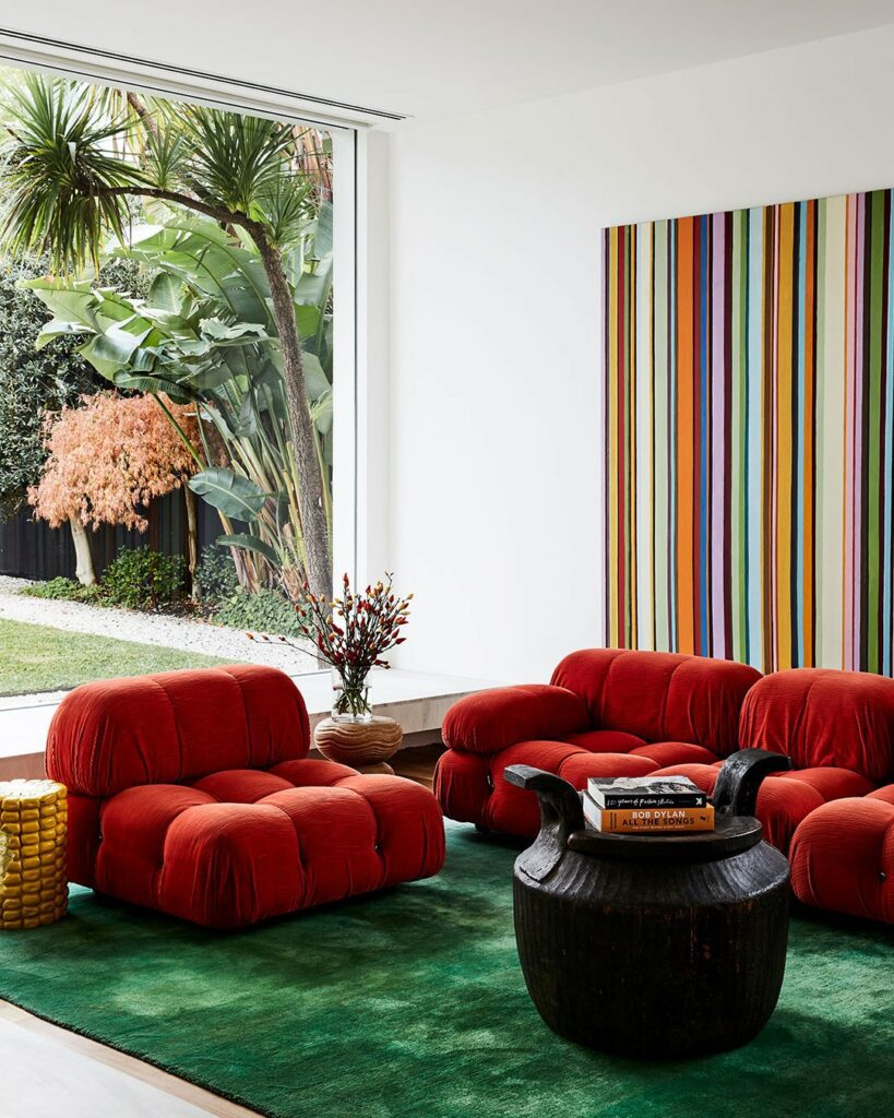
Red
Associated Psychology:
- Increases Appetite: Red, as a warm color, is known to increase heart rate and create a sense of urgency. This makes it a popular choice in restaurants, encouraging diners to eat quickly and move on.
- Energizing and Invigorating: These tones can also create a sense of warmth and energy, making them suitable for social spaces like the living room or entryway.
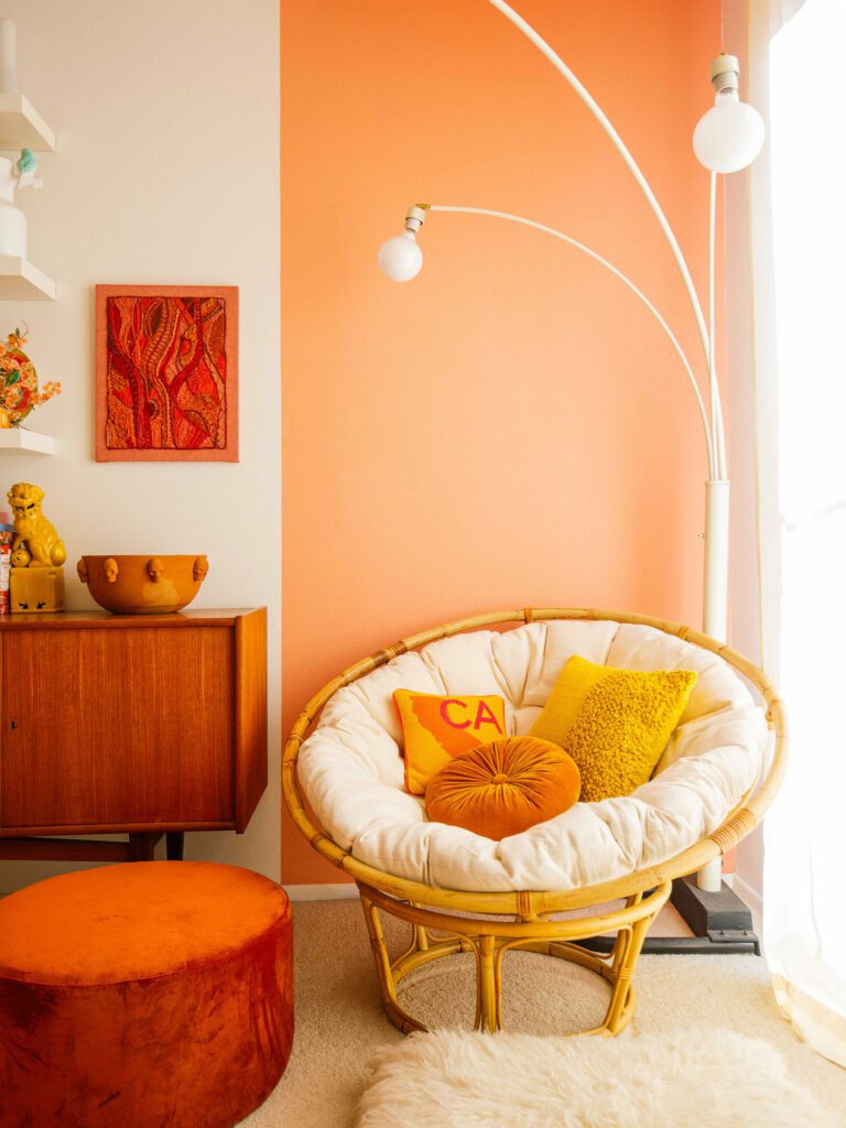
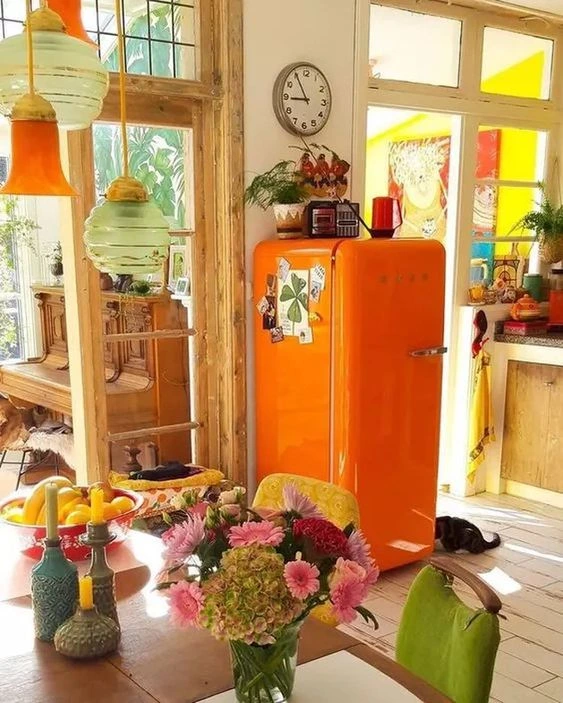
Orange & Yellow
Associated Psychology:
- Promotes Enthusiasm and Creativity: Orange hues are vibrant and known to evoke feelings of enthusiasm and creativity. They can be used in spaces like the office or creative corners within the home. Yellow is often associated with happiness and positivity. It can bring a sense of brightness and cheerfulness, making it suitable for kitchens and dining areas.
Green
Associated Psychology:
- Calming and Restorative: Green tones evoke a sense of nature and tranquility. They can promote relaxation, making them ideal for bedrooms or bathrooms, where a serene atmosphere is desired.
Blue
Associated Psychology:
- Soothing and Serene: Blue hues are calming and have a relaxing effect, reducing stress and promoting a sense of tranquility. They’re perfect for bedrooms and bathrooms to encourage relaxation and quality sleep.
Neutrals
Associated Psychology:
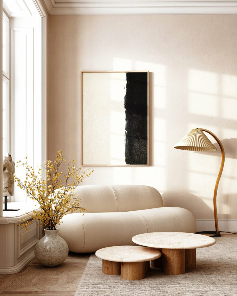
- Versatile and Timeless: Neutral colors like beige, ivory, or taupe are versatile and timeless. They create a sense of balance and harmony, making them suitable for any room in the house. They can be used as base tones to complement other vibrant colors.
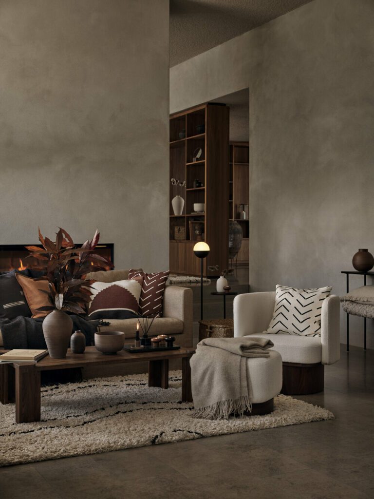
Brown
Associated Psychology:
- Warmth and Stability: Brown tones are grounding and create a feeling of stability and comfort. They work well in living rooms or entryways to provide a sense of warmth and coziness.
Read more: Nutshell Brown | 2024 Key Color Trends
Optimal Use of Colors in Different Spaces
Living Rooms
Redish Tones, Orange, Neutrals, Brown: Use warm reds, oranges, and neutral browns as accent colors in pillows, rugs, or artwork to create a cozy and inviting atmosphere.
Bedrooms
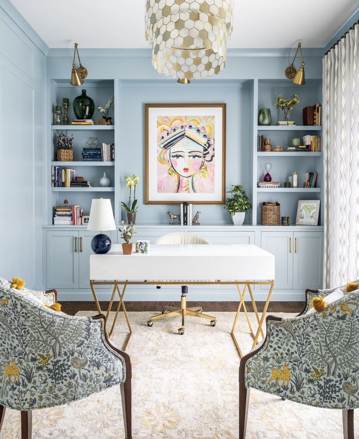
Blue, Green, Neutrals: Incorporate calming blue or green tones in bedding, curtains, or wall colors for a serene and restful environment.
Dining Rooms and Kitchens
Redish Tones, Yellow: Introduce red or warm yellow accents in the dining area to stimulate appetite, while yellow can bring cheerfulness to the kitchen space.
Offices
Orange, Neutrals, Blue: Use energizing orange tones or shades of blue to foster creativity and concentration. Neutrals can provide a calming backdrop.
Bathroom
Blue, Green, Neutrals: Create a spa-like atmosphere with calming blue or green hues, paired with neutral tones, to promote relaxation.
*Like what you’ve read? Feel free to share on your social media! If you want to see more articles click here.*| Don’t forget to follow us on our social media, Instagram, Pinterest and Youtube.