Light blue has long held a quiet but powerful place in the world of interiors, it sits in a nuanced space between color and atmosphere. In recent years, light blue has re-emerged as a defining element within evolving color trends, valued for its ability to evoke calm and timeless elegance.
Color is never just visual; it is emotional and psychological. Unlike cooler whites or pale grays, light blue introduces softness without heaviness. It reduces visual tension while still offering character.
Designers often describe light blue as restorative. It slows the pace of a room, encourages focus without stimulation, and creates an atmosphere of quiet confidence. These qualities make it especially relevant in a time when wellness-driven design and mindful living shape global color trends.
Today’s color trends are less about novelty and more about longevity. There is a clear shift toward colors that feel livable, adaptable, and emotionally intelligent. Light blue fits seamlessly into this movement.
Rather than appearing as a single, fixed hue, light blue now spans a wide spectrum—from misty, almost-gray blues to airy pastel tones and chalky, mineral-inspired shades. This diversity allows it to adapt to different styles while remaining recognizably calm and modern. On Pinterest’s Trend Predicts for 2026, Cool Blue was one of the trend spotlights for this year.
Beyond aesthetics, light blue plays a functional role in shaping how spaces are perceived. Lighter hues naturally reflect more light, making rooms feel larger and more open.
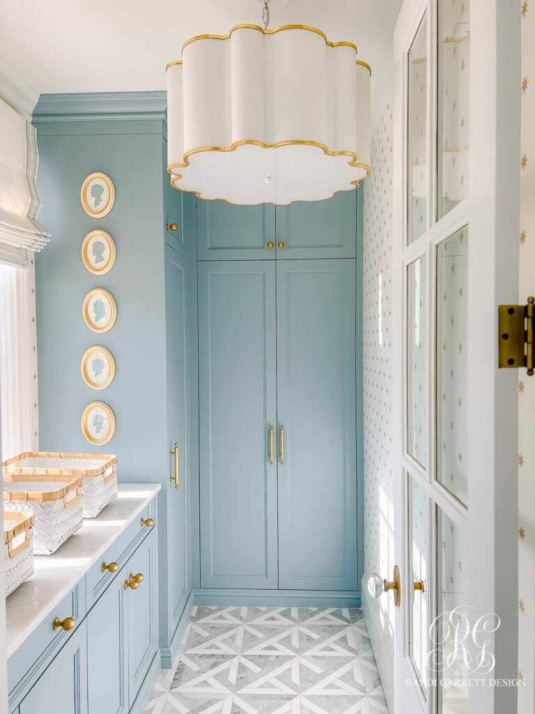
In smaller interiors or rooms with limited natural light, light blue walls can visually push boundaries outward. This quality explains its frequent use in apartments, narrow hallways, and compact bedrooms within modern interior design trends.
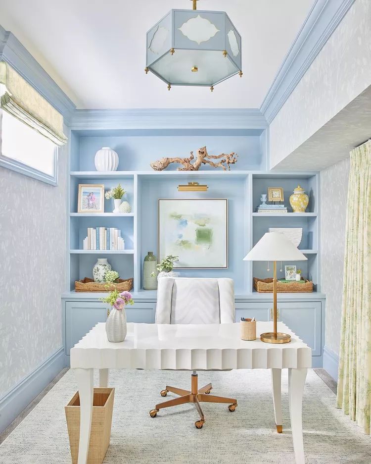
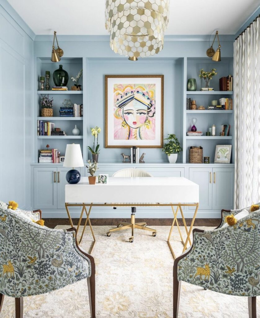
Ceilings painted in light blue can subtly lift a room, while light blue cabinetry or built-ins can feel less imposing than darker alternatives. Designers increasingly use the color strategically—not just decoratively—to support spatial clarity and comfort.
In living spaces, light blue acts as a stabilizing backdrop. Used on walls, it allows furniture, art, and textures to take prominence without competing visually. Upholstery in light blue—whether linen sofas or accent chairs—introduces softness while remaining neutral enough for evolving decor.
Layering is key. Pairing light blue with warm materials such as oak, walnut, or woven textiles prevents the space from feeling cold. This approach aligns with broader interior design trends that emphasize tactile contrast and material honesty.
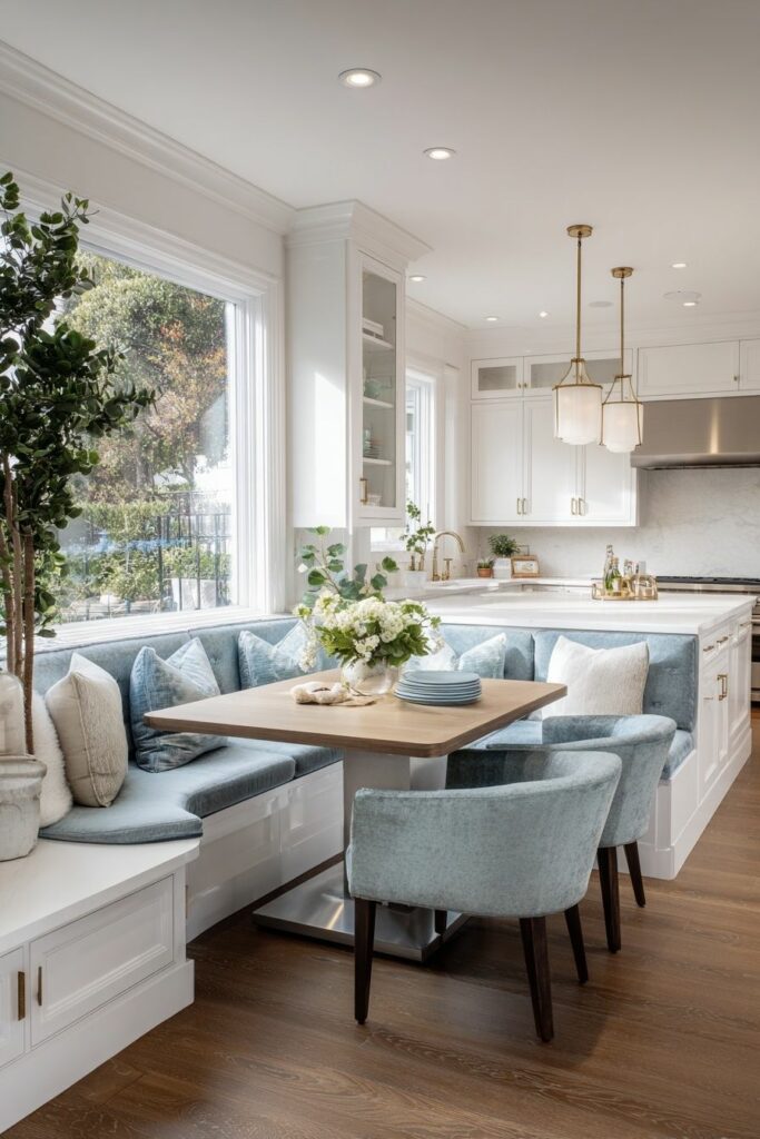
Light blue kitchens have grown increasingly popular as alternatives to white or gray. Cabinetry in pale blue feels fresh yet timeless, offering subtle personality without overwhelming the space. When paired with stone countertops, brushed metals, or handmade tiles, light blue brings warmth and approachability.
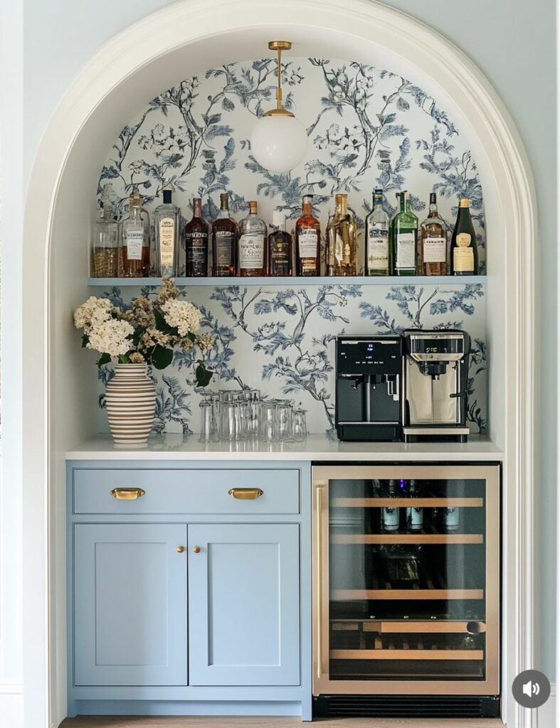
In dining areas, light blue walls or seating encourage a relaxed atmosphere. The color promotes calm conversation and balance, aligning with the social function of these spaces.
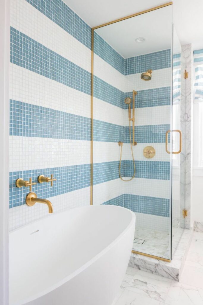
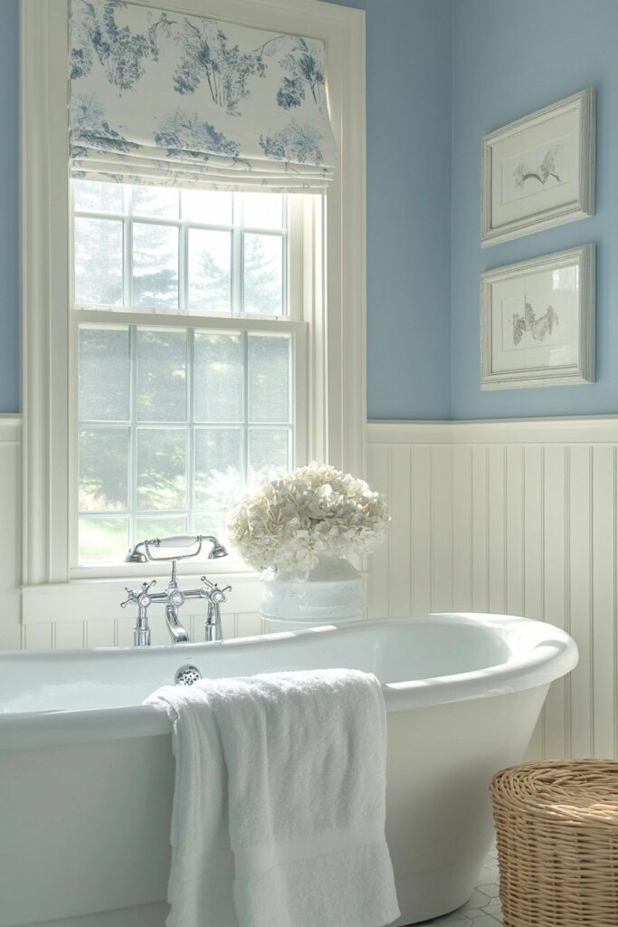
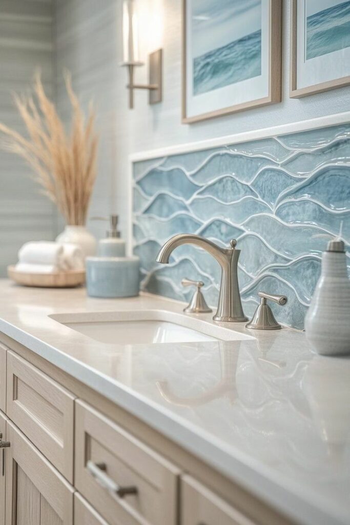
Bathrooms naturally lend themselves to light blue due to their association with water and cleanliness. Here, light blue can range from barely-there hues to more saturated pastels, depending on the desired mood.
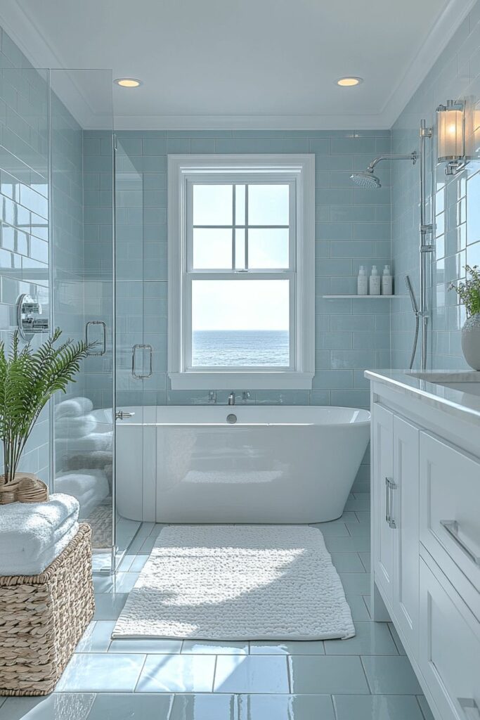
Current color trends favor pairing light blue with natural stone, terrazzo, or matte finishes to avoid overly glossy or traditional looks. The result is a bathroom that feels spa-like, modern, and quietly luxurious.
Pairing Light Blue With Other Colors
Effective color pairings elevate light blue from pleasant to compelling. Current color inspiration favors combinations that feel organic and balanced.
Light Blue + Warm White: Clean and timeless, ideal for modern interiors.
Light Blue + Soft Gray: Sophisticated and calming, suitable for transitional spaces.
Light Blue + Muted Green: Nature-inspired and contemporary.
Light Blue + Pale Terracotta or Sand: Adds warmth and contrast without overpowering.
These pairings reflect a broader movement within interior design trends toward harmony rather than contrast-driven drama.
Trends come and go, but some colors persist because they meet deeper needs. Light blue endures because it adapts—to styles, to spaces, to emotional expectations.